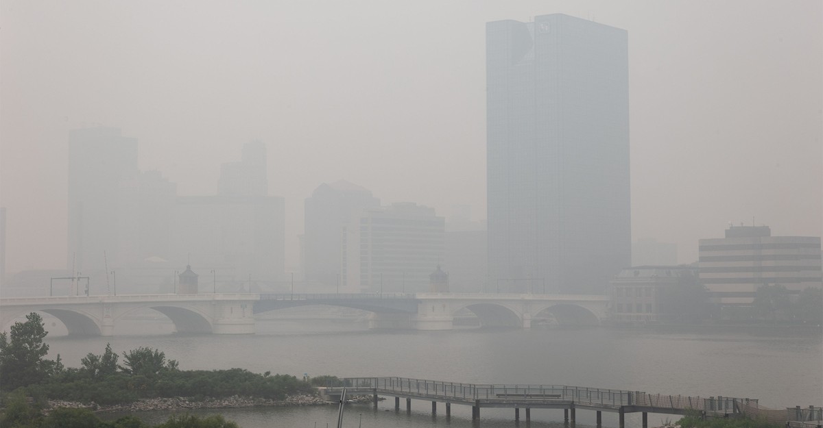
The air is bad this summer. Really, it’s historically disgusting. Smoke from wildfires has gusted over people’s homes, spreading haze and yellowing the sky. Last week, four midwestern cities—Chicago, Detroit, Milwaukee, and Toledo—reached the highest levels of particulate pollution they’ve recorded in two decades. For more than 100 million Americans across at least 20 states, the weather was grim: fumy with a chance of scattered lung conditions.The air was bad like this two years ago, during that summer’s set of conflagrations—and let’s not forget the epic plumes of 2021, which turned the full moon over New York City a ghastly shade of red. Welcome to the new America: the land of burning throats.In some respects, our skies have gotten cleaner in the past few decades; average levels of fine particulate matter have been cut nearly in half since 2000. But wildfires have been getting bigger and more frequent, and sending off plumes of air pollution that come and go in noxious episodes. The climate trend goes in only one direction, so this will be our future. That means we’ll need to have a better sense of when it’s safe to be outside, when it’s time to skip our morning stroll, and when we ought to keep our children home from camp. We’ll need to learn to live with smoke.Enter the air-quality index: a weather metric for the age of wildfires. Perhaps you have never heard of the AQI or noticed it only last week, in news reports and weather-app alerts, when the smoke was getting thick. Chances are that you’ll be looking at it quite a bit in years ahead. But the AQI’s color-coded warnings, which run from wary orange (“unhealthy for sensitive groups”) to Grim Reaper maroon (“hazardous”), are useful only in the broadest sense: They may call attention to the risks of breathing smoke and remind you to be careful. As a tool, the AQI is inconsistent overall—its forecasts can be slow and imprecise, and its particulars don’t always have a bearing on direct experience. If wildfire events will get only more common, then this lousy measure must be fixed.Globally, there’s no agreement on what constitutes unhealthy air—and no standard index of air quality. America’s version of the AQI was first created 50 years ago, as a way to standardize recording and reporting of pollutants and to clarify communications to the public. The system works like this: The concentrations of five pollutants—particulate matter, ozone, sulfur dioxide, nitrogen dioxide, and carbon monoxide—are measured throughout the day at thousands of monitoring stations across the country; the readings are then combined and measured against safety thresholds that are based on regulatory limits. The AQI score is assigned such that a value of 100—which is supposed to mark the line between safe conditions and potential hazards—corresponds to standards set by the federal government.Even just that fact can be a problem, Kevin Cromar, the director of the Health, Environment, and Policy program at NYU’s Marron Institute of Urban Management, told me. The regulatory limits for pollutants are, in theory, a reflection of those pollutants’ risk to human health. But that connection may be indirect, and the thresholds certainly aren’t calibrated perfectly for use by members of the public, who might use the AQI to figure out whether it would be safe to take a walk.Another problem stems from the distribution of air-pollution sensors around the country. Where these are abundant, as in major cities, the reliability of any given reading might be high. But other parts of the country are more like sensor deserts, where AQI scores are interpolated from readings made in far-off places, and precision is reduced. The variation in uncertainty is not communicated to the public. AQI reports tend to look the same—a single number—no matter where you are.In some countries, air-quality scores are calibrated to reflect whatever mix of pollutants happens to be airborne on any given day. The United States is more single-minded: It focuses only on whichever pollutant has a concentration that most exceeds the standards, and disregards the rest. If, say, there was enough nitrogen dioxide on Monday for an AQI score of 105 and enough ozone for a score of 103, our air-quality reports would give only the former number: 105. Now imagine that on Tuesday, the nitrogen dioxide held at 105, while ozone levels dropped to 30. The resulting AQI report would look the same as it had the day before—again, 105—even if the air felt much better in the lungs of a person with asthma. Given this design, Cromar said, the meaning of the index may even be inverted from time to time, with a higher AQI corresponding to a lower risk of health effects.This sort of issue would be easy to ignore under conditions like last week’s, when a single factor—particulate matter from wildfire smoke—dominated readings. But the mixed-pollutant problem points to a deeper issue with AQI: It can be hard to know what the numbers really mean. AQI reporting isn’t standardized across weather apps and news reports. In some places, you might see the measure as a total average for the day; in others, you’ll get a moving average (known officially as NowCast) that tries to show you how air quality is changing by the hour; still others, such as the basic weather app on my Google phone, offer up a mysterious hybrid of the two. Cromar told me that even people in his field—which is to say, the most sophisticated consumers of this sort of information—may be flummoxed by the range of AQI reports. “It’s a mess,” he said. “There’s just a lot of different information out there, and it’s unreasonable to expect the public to somehow make sense of all that.”Then there’s the fact that different people may react in very different ways to the same concentrations of particulate matter, or the same readings on the index. In a smokier era, we’ll each have to learn for ourselves how the AQI numbers that show up on our phone relate to our sensations and experience. Cromar said that we’ll have to form new types of weather intuitions: Oh, the AQI is 135; I know what that feels like—I’ll put off my shopping ’til tomorrow.Or maybe we could just get rid of AQI completely and have our apps provide us with raw measurements instead: a daily digest of pollutant concentrations, laid out in micrograms per cubic meter. At first, these data would be cryptic—who besides the biggest air-pollution nerd would know the difference between 35 μg/m3 of particulate matter (yellow-level risk, per AQI) and 60 μg/m3 (red-level risk)? But then again, none of us was born with the understanding that 35 degrees Fahrenheit is cold and 60 degrees is pretty nice. I also had to learn, at some point in my adult life, that 35 percent relative humidity is very dry for where I live, whereas 60 is about average. This is true for every number in our weather apps: the daily highs and lows, the chance of rain, the UV scores, the pollen counts. You have to gain a feel for what they mean.We’ve already formed internal models when it comes to measured temperatures, wind-chill factors, and the heat index. Now the weather’s turning, and it’s time to do the same for smoke.
Weather Forecasts Aren’t Made for Smoke Like This
Full Article
Original Source
Read the full article at Theatlantic →KhanList aggregates and links to publicly available news content. We do not host full articles from third-party sources. Always verify important information with original sources.