
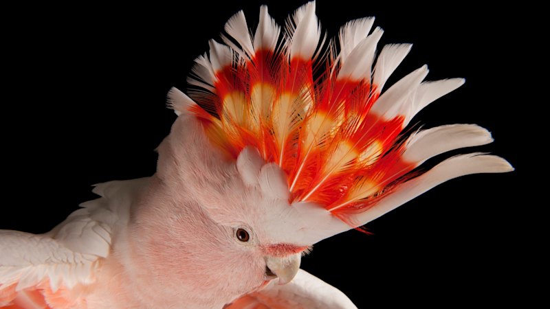
They describe it as the “A-ha!” moment – an image of a pink cockatoo, its crest raised. Almost like … a flame.An Olympic flame.For the consortium of agencies tasked with designing the Brisbane 2032 Olympic and Paralympic emblems, it was too much to ignore.“We looked at everything under the sun, including the sun,” Landor creative director Andy Thomas says, after giving this masthead a sneak peek at the emblem last month.“We had a list of hundreds of different things that the emblem could be – the longest list, the most exhaustive list.“We didn’t want to leave anything. We went through them all, and we could see something there, so we put a note against the cockatoo and kept coming back to it.”A Guardian article about Queensland’s palm cockatoo opened the door, but it was one particular image – a photograph from acclaimed National Geographic photographer Joel Sartore – that sealed the deal.“When we first saw the image of the pink cockatoo’s crest set against the black background, you can’t help but notice a flame,” Thomas says.“It came together in that moment. It felt like that could be the one, but we still had to get around the idea of the cockatoo being a character with a strong personality. So there was a little bit more work to do around that.”This Joel Sartore image of a pink cockatoo at Parrots in Paradise in the Glass House Mountains was the inspiration for the Brisbane 2032 emblem.Joel SartoreAnd work they did. The walls at the design team’s South Bank headquarters are lined with different iterations of the cockatoo logo – some left-facing, featuring distinctive beaks.But, hang on, what if you face it the other way?“Then it resembles the shape of Queensland,” Thomas says.“Then there were subtle things. We had six feathers at one stage, so let’s make it five feathers for the five Olympic rings. And what if we just separate them a little bit – then you have a three and a two, as in ’32.”The Olympic emblem is based on the pink cockatoo, with its fire-coloured crest.The Paralympic emblem is based on its cousin, the sulphur-crested cockatoo – testing showed it was easier for people with vision impairments to see.The sulphur-crested cockatoo inspired the Paralympic emblem.Gary SissonsThomas says although the end product has many layers, none of it felt forced.“The hardest part to design was the eye,” he says.“Eyes are a nightmare because if you just did a circle, it looked weird, but that’s what a cockatoo’s eye is.”Enter the anthropomorphic flourish – the shape of an upper cheek, to give the impression of a smile.Six distinct segments with six distinct meanings – the cockatoo, the flame, the shape of Queensland, the year 2032, the eye looking towards Brisbane, and the cheeky attitude.Landor general manager Trish Folan says the cockatoo motif “was definitely a zag” for the whole design team.“The story was the thing we all fell in love with,” she says.“Compared to all the other ideas on the table at the time, the story of the cockatoo – the cheeky personality, that larrikin spirit, the thought that it was quite different for an Olympic emblem – it was a bit of a risk.“But it was also the most interesting thing we were looking at from the start. We all started to gravitate towards it.”And the layers of meaning – hidden in plain sight – just reinforced that decision.“When you work on something for so long, you can start to find the ways that it has more meaning,” Folan says.Andy Thomas (Landor), Brent Hill (Brisbane 2032), Trish Folan (Landor) and Adam Kennedy (VML) explaining how they created the Brisbane 2032 emblem.Brisbane 2032“But that was a real moment where we went, ‘Oh gosh, great!’ – that from the idea that we all love, suddenly we’ve found all these extra meanings.“We knew that was enough to get it across the line.“People love to dissect Olympic emblems, and you need all those stories. We didn’t set out to build them all in from the start, but as they popped out naturally and started to appear, they felt so normal as part of the design.”Adam Kennedy, the managing director of brand positioning agency VML, had his own Olympic dreams as a younger man – the would-be Olympian tried out for the British canoe sprint team for both Sydney 2000 and Athens 2004.Now, Kennedy’s helped shape Brisbane 2032.“I finally made it to an Olympics,” he says.It started to become pretty clear to the team that the cockatoo motif was the winner late last year, Kennedy says, but not before they had gone through about 400 different ideas.“I won’t tell you what came close,” he says.“There were four emblems on the short list, but this was actually always pretty much everyone’s favourite.“There was one other that was there or thereabouts, but this one just immediately resonated with most people.The evolution of the cockatoo design.Brisbane 2032“We explored flora – a lot of iconic plant life and flowers, etc. We explored other fauna – the reef was a place that we looked at – and then other natural landmarks or places. The coastline, the forest, the Brisbane River.“There were definitely some places where we said, ‘don’t play here’ – we probably didn’t want to use a crocodile, right?“It was important in that decision-making process early on, as we made some strategic calls about not choosing natural icons that would exclude big parts of Queensland.”The emblem, inadvertently released on Friday night, was the culmination of more than four years of blood, sweat and tears, and Kennedy, along with the rest of the design team, is excited – and nervous – to finally have it in the public domain.But he realises it won’t be for everybody, and the rise of artificial intelligence will no doubt result in an avalanche of alternative emblems all over social media.“You have to be a realist on it, and that we live in a world today where anyone who is a non-specialist can jump in and prompt something that they think might be OK,” he says.“My favourite little line when I get asked this question is – just because you’ve got a voice doesn’t mean you should sing.“What people don’t see is the incredible process behind getting to something that’s simple on a sheet of paper, which starts with a whole heap of research and insight, turns into a brand strategy, and then turns into a design process and a whole heap of craft to get to something as polished and as deep and meaningful as that.“So, everyone’s welcome to have a go. If other people want to see if they can better it, they’re going to do it anyway. I can’t stop them.“We just have to stand behind the work that we’ve done and the decisions that we’ve made. And we think we’ve done it all putting Queenslanders and Australians first, and hopefully, they see the joy in it that we see.”For Brisbane 2032 marketing boss Brent Hill, it’s more than just seeing joy – it’s seeing the money.The privately funded organising committee believes the emblem will unlock more revenue streams through commercial partnerships and Brisbane 2032 merchandise that’s already prepared for rollout.Hill says the International Olympic Committee is excited by the Brisbane 2032 emblem and genuinely impressed by the process by which it was created.A public campaign for the Australian white ibis, or “bin chicken”, to feature on the emblem was noticed, Hill says, and even gave the team the scope to land on the cheeky cockatoo.The emblems for the Brisbane 2032 Olympic and Paralympic Games.Brisbane 2032“We were hand in glove [with the designers], late at night, leading into Christmas, agonising over fonts, exact positioning, exact colours,” he says.“It’s been an incredible journey to be on, and something that you put a lot of time and effort into, but the payoff is huge.”Ultimately, Hill says, the emblem is about putting a face to the Brisbane 2032 name.“The really exciting thing about that is we’re starting to tell the world about what Brisbane and Queensland are all about, and what our Games are going to be like,” he says.“People are starting to learn stuff about us. They’re going to learn about cockatoos. They’re going to learn about our reef. They’re going to learn about Brisbane, and they’re going to go, ‘My God, I need to get down there – this place is incredible’.”Ahead for Brisbane 2032 is the official mascot or mascots. Does the cockatoo emblem offer a clue in that department?“I’m interested just to see how it plays out in terms of how much people embrace this,” Hill says.“We’ve got more to come. There are more things and more elements within the emblem that we can reveal that are really exciting. The more people embrace that, the more we can look at that and go, ‘What else could we do?’”Start the day with a summary of the day’s most important and interesting stories, analysis and insights. Sign up for our Morning Edition newsletter.
‘The living flame’: Why Brisbane 2032 emblem designers chose a cheeky cockatoo
Full Article
Original Source
Read the full article at Smh →KhanList aggregates and links to publicly available news content. We do not host full articles from third-party sources. Always verify important information with original sources.