
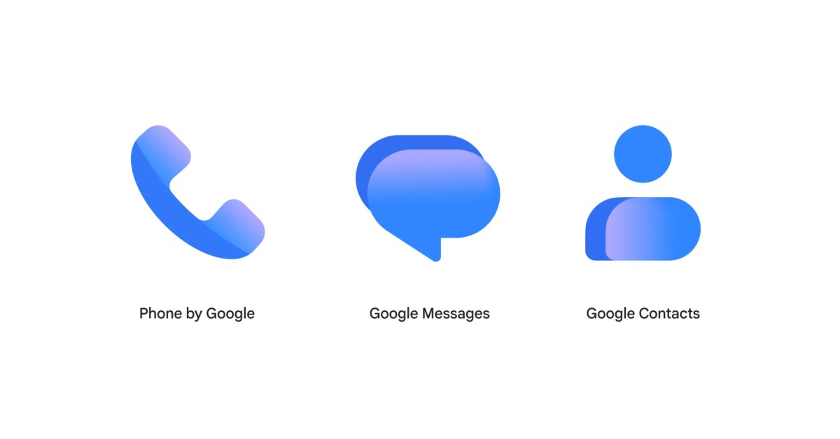
Following the Messages update earlier this week, Phone by Google has received its redesigned gradient icon in the beta channel. Version 246 of Phone by Google — as the app is still officially called to presumably avoid the Pixel overlap that comes with “Google Phone” — is rolling out today to the beta channel. Compared to the previous iteration, the handset in the new icon is a bit larger. Otherwise, the general shape remains the same and shouldn’t cause any confusion. Old vs. new By leveraging gradients for the earpiece and mouthpiece, the new design feels flatter and lighter than the old one. Additionally, the darker blue shade has been removed entirely. Google says the “app icon is now crisper, clearer, and designed to look sharp on your home screen.” We also refreshed the coloring, spacing, and gradients to bring the icon closer in line with the modern look of the rest of the Google ecosystem. Now, the Phone app blends seamlessly with all your other Google tools, making your screen feel cohesive and clean. There are no other changes to the app with this update. Zooming out, Google has yet to roll out the restored Contacts tab to stable users as of today. Phone by Google 246 should see a stable rollout in the coming weeks. You can join the beta via the Play Store listing. FTC: We use income earning auto affiliate links. More.
Phone by Google 246 beta brings gradient icon redesign on Android
Full Article
Original Source
Read the full article at 9to5google →KhanList aggregates and links to publicly available news content. We do not host full articles from third-party sources. Always verify important information with original sources.