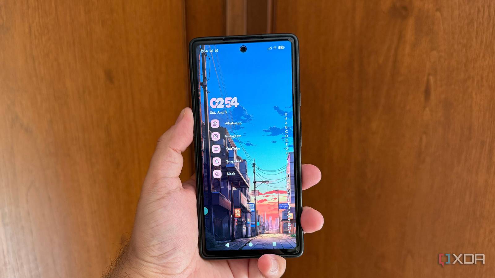
Published Aug 9, 2026, 5:30 PM EDT Beginning his professional journey in the tech industry in 2018, Yash spent over three years as a Software Engineer. After that, he shifted his focus to empowering readers through informative and engaging content on his tech blog – DiGiTAL BiRYANi. He has also published tech articles for MakeTechEasier. He loves to explore new tech gadgets and platforms. When he is not writing, you’ll find him exploring food. He is known as Digital Chef Yash among his readers because of his love for Technology and Food. I've used the Pixel Launcher ever since I switched to a Pixel phone, and I completely understand why so many people like it. It's fast, clean, and blends perfectly with Android. Everything feels smooth, from opening apps to searching for files, and Google's animations make the whole experience feel polished. It also avoids the clutter that many manufacturer launchers add, which is something I've always appreciated. For the longest time, I never felt the need to replace it. It handled everything I needed without slowing my phone down or getting in my way. Its features and overall simplicity made it easy to recommend to anyone seeking a reliable Android experience. But the more I started personalizing the rest of my phone, the more the Pixel Launcher stood out for the wrong reasons. I realized that while Google had built an excellent launcher, it was designed around Google's idea of how a home screen should look and work, not mine. That's what eventually pushed me to look elsewhere. Google's customization limit is real My home screen, Google's rules The biggest issue I had with the Pixel Launcher wasn't performance; it was the lack of choice. Google lets you change wallpapers, icon colors, and add widgets, but that's about where the customization ends. But I always wanted more control over how my apps were organized. I couldn't freely adjust the grid layout, hide apps the way I wanted, or make the home screen fit my workflow instead of Google's. Every time I tried to personalize it, I ran into another limitation. None of these restrictions made the launcher unusable, but together they made it feel like I was borrowing someone else's setup. After a while, I stopped asking what Google wanted my home screen to look like and started looking for a launcher that would let me build it the way I wanted. I switched to a launcher that lets me decide everything The launcher that adapted to me After trying a few launchers, I ended up sticking with Niagara Launcher because it changed the way I interacted with my phone without making things more complicated. The first thing I noticed was how little time I spent searching for apps. The alphabetical app list is always within reach, and scrolling through it feels much faster than opening a traditional app drawer. I also started using features I couldn't get with the Pixel Launcher. I assigned swipe actions to my favorite apps, created cleaner folders, and trimmed my home screen down to only the things I actually use every day. Instead of filling multiple pages with icons and widgets, I now have a setup that stays uncluttered while still giving me quick access to everything. The best part is that I can keep adjusting it whenever my needs change. I'm not locked into a layout that someone else decided was best. My home screen has become something I can refine over time, and that's exactly the kind of flexibility I was missing before. My phone feels more personal It finally feels like my own Niagara Launcher doesn't just let me change how my home screen looks; it changes how I use my phone. I have my favorite apps pinned on the home screen, while everything else is just a quick swipe away in the alphabetical app list. I don't have to open an app drawer or swipe through multiple pages to find what I need. The swipe actions have also become one of my favorite features. I can assign a second app or shortcut to an icon, so a single swipe opens something completely different. That keeps my home screen clean without reducing functionality. I also like that notification previews appear directly on app icons, letting me read or dismiss messages without opening another screen. Niagara Launcher also gives me control over small details that make a big difference. I can hide apps, change icon packs, adjust fonts, customize gestures, and tweak the layout without making the launcher feel complicated. It stays lightweight and fast while still offering plenty of options. The Pixel Launcher still delivers a polished Android experience, but Niagara Launcher makes my phone feel like it was designed for me instead of for every Pixel user. That's why I don't see myself switching back anytime soon. Your home screen should work for you At the end of the day, I don't think every Pixel owner needs to replace the Pixel Launcher. It does exactly what Google designed it to do, and it does it well. But I also don't think a launcher should decide how I use my phone. That's why Niagara Launcher has stayed on my device. It gives me the flexibility to build a home screen around my habits rather than adapting to someone else's design. For me, that extra control has made a bigger difference than any new Android feature Google has added. Niagara Launcher is a minimalist Android home screen.
I replaced the Pixel Launcher over one limitation I couldn't ignore
Full Article
Original Source
Read the full article at Xda-developers →KhanList aggregates and links to publicly available news content. We do not host full articles from third-party sources. Always verify important information with original sources.