
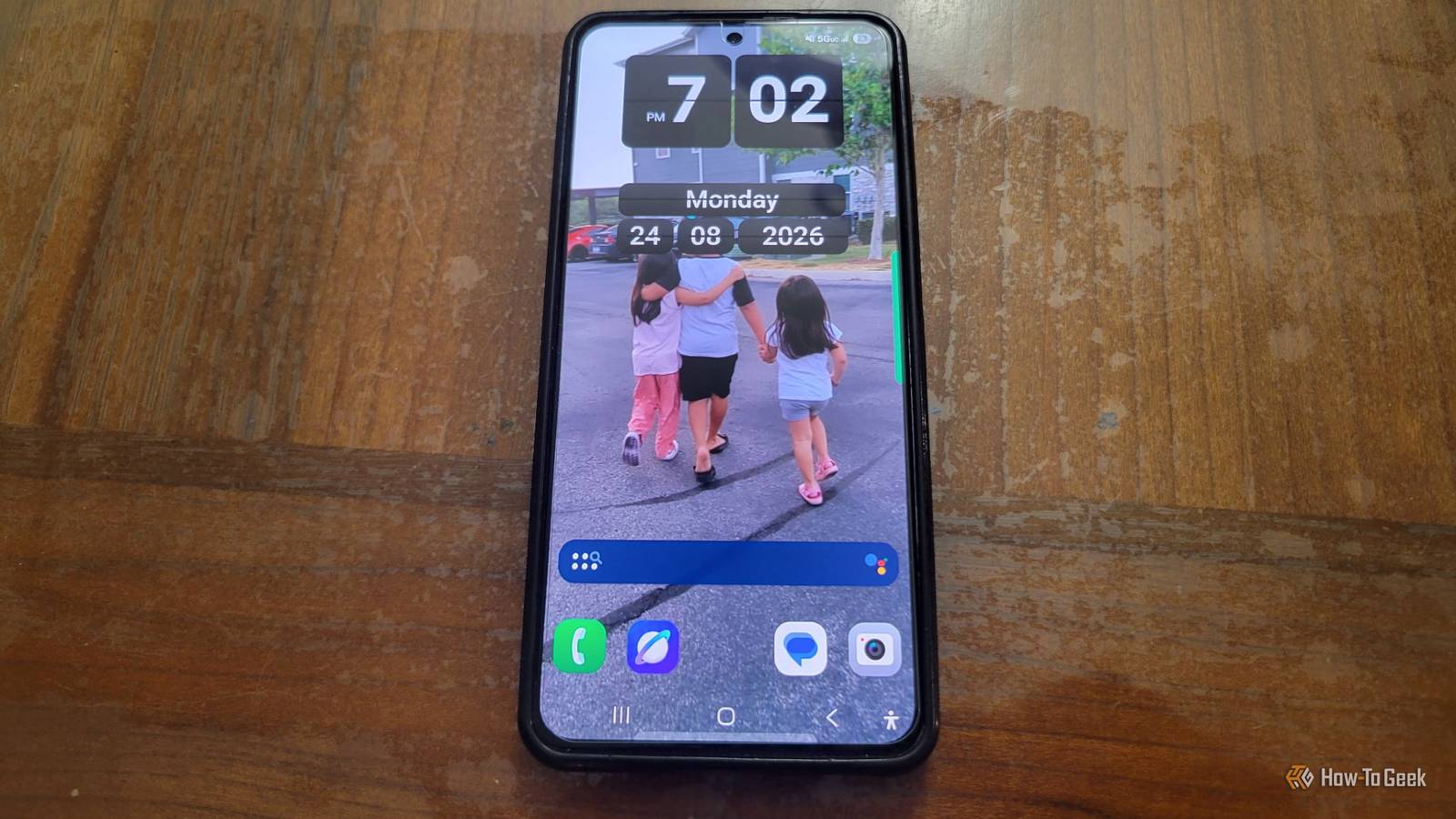
Published Aug 25, 2026, 12:45 PM EDT Aggy is a veteran writer and editor in the technology and gaming space. Having served as a Managing Editor for high-traffic digital publications, alongside being an editor and consultant for over a dozen sites. Aggy's published work spans a wide and respected array of tech and gaming outlets, including WePC, Screen Rant, How-To Geek, Android Police, PC Invasion, and Try Hard Guides. Beyond editorial work, Aggy's direct experience in the tech sphere extends to app development. Aggy has published two games under Tales and is always eager to learn and do more. He also likes working on computers and researching in his spare time. He knows about Windows, Linux, Audio, Video, and much more. Phones used to look and act very differently, and you could tell what the brand was just from turning it on. We had to watch that personality get replaced with flat icons and white space. The HTC Sense was one of the first Android skins that made a phone feel like it was unique, and we lost a great UI when the company started playing it safe. Luckily, you can rebuild something close to it on a modern Android phone. HTC Sense gave phones real personality before everything got boring That old interface was fun to use Credit: Jorge Aguilar / How-To Geek I had an HTC Sense back in the day, and I actually subconsciously kept setting up my screen to look a lot like it. It wasn't until I started to try this that I realized how much of my screen was designed off of the HTC Sense, which was my first smartphone. HTC used to be great for personalization, but the company slowly began stripping things back to fit better with Google's clean look, removing flashy reflections and adding a dock you could customize. It was once a really cool brand to use, and by the time I graduated High School in 2012, I noticed a lot fewer people using it. By the mid-to-late 2010s, HTC had basically walked away from all that unique customization and started following stock Android directly. Eventually, that old interface slowly disappeared. What made people love Sense so much back then was how great it felt to use it. My favorite was the animated weather flip-clock widget, which looked like one of those old mechanical split-flap displays. When time changed, the numbers would fall forward with animation that simulated gravity, the drop, and even a little spring-back bounce. Unlocking an HTC phone would set off full-screen weather effects that had windshield wipers sweep across the screen to clear raindrops, sunbeams would shine over your apps, and fog would drift across the edges of the interface. It was super cool and something you rarely see today. There's a whole retro-recreation community trying to bring these old interfaces back, and it's really just about nostalgia. However, I get it, because I hate Material Design and Material You that Google rolled out. It basically moved the whole industry toward flat, geometric, minimalist design. It did clean up the messy fragmentation from the early days, but it went too far and removed the personality and warmth that used to make custom skins feel like they were yours. You can get pretty close to the old look on your current phone You need to get your grid and layout dialed in So I spent time trying to rebuild that classic HTC Sense layout on my current phone, and it's a longer process but totally worth it if you miss that era. You're going to want to start with Nova Launcher because you need really granular control over spacing and layout. Under Nova Settings, you find Desktop, and you need to set the Desktop Grid to something big, like 4x4, but I chose to keep my stupidly dense. I like 7x6 better. That density is the only way to fit big widgets next to regular app shortcuts without everything feeling cramped. But you can pick what you want since it's your version of this. Then you turn on Subgrid positioning. I hate how rigid launchers normally are with icon snapping, so I'd use this anyway. It lets you place icons and widgets halfway between grid cells instead of forcing everything into fixed slots. You absolutely need that if you want the clock and weather centered perfectly. Don't worry about how it used to look; give yourself a style you like. It's more fun that way. You also need to set both width and height padding to None under desktop margin controls. That removes the default outer margins, so custom widgets can stretch all the way to the edges of the display. That full-bleed look is what made early Sense devices feel so dramatic. For the 3D depth feature, go into desktop settings and set the home screen transition to Cube. It's a small touch, but it mimics that spatial carousel from Sense 3.0 surprisingly well. Make sure to bump the Icon Size to 125 percent under Look and Feel, which sounds excessive, but those old HTC touch targets were huge and honestly easier to use. For icons, you should point the launcher theme to Delta Icon Pack because it uses those soft pastel palettes and clean lines from late-stage Sense 6.0. To keep unthemed modern apps from looking out of place, force the adaptive icon shape engine to use rounded squircle shapes with a custom mask layer. That way, even weird modern vectors get wrapped in a soft physical border. You shouldn't try to copy it exactly, just make it your own mix. No company will make the perfect UI for you, and it's a lot cooler to make your own choices along the way. This is already a good start and will make you feel like it's the old HTC Sense. Building it today comes with a few real downsides This setup actually runs better than the real thing ever did Credit: Jorge Aguilar / How-To Geek I like this look a lot more than the original, but bringing back those classic Android interfaces on a modern phone comes with some real issues. Android is pretty strict about what apps can do in the background, so the system stays fast, and the battery doesn't tank. Back in the early days, background threads just ran wild without much oversight. Now, if you want something like KWGT to constantly update custom widgets, it has to keep an active process alive in memory just to evaluate formulas and redraw things. On cheaper or older phones with limited RAM, that kind of constant background rendering can lead to aggressive garbage collection loops or the system's low-memory killer might just shut the launcher down altogether. The biggest issue is that your battery is designed to save itself from overuse. So your real-time widgets and wallpaper might freeze or fall behind on weather and system updates unless you go out of your way to exempt them. I remember setting up a Sense-style clock widget and watching it just stop updating the temperature halfway through the day. That was annoying. Launcher layouts are also different from what they used to be on original hardware. I remember that old versions of HTC Sense had horizontal paginated panels, but today, we're pretty much done with that. Now we have vertical scrolling lists, so that's kind of unavoidable. You can force it with workarounds, but it never feels quite right. I have a pretty good memory of those custom skins, and I can tell you from experience that they were slow and made the phone really hot. You can't really bring back the old HTC Sense, but this is a much better and more modern version, in my opinion. This is better than the original Recreating this look is fun, and it shows that we could have kept the uniqueness of every brand. However, this is a version that runs better than the original ever did, even if it doesn't match it exactly. I can say from memory that those old skins ran hot, lagged constantly, and chewed through the battery.
HTC Sense was Android's best UI, and I finally figured out how to bring it back
Full Article
Original Source
Read the full article at Howtogeek →KhanList aggregates and links to publicly available news content. We do not host full articles from third-party sources. Always verify important information with original sources.