
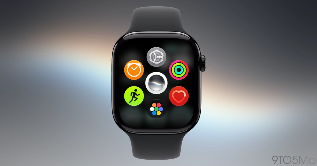
When watchOS 27 is released later this month, Apple Watch users may notice that some things work a bit differently. The upcoming software update removes three features that users may miss after updating. Walkie-Talkie removed from Apple Watch First up is Walkie-Talkie, Apple’s real-time voice communication app that only works between Apple Watches. Personally, Walkie-Talkie never clicked for me, especially because leaving it on meant having the yellow app icon on your watch face. Others who use it in real-world situations are already missing it, and more people will notice this month (and on new Apple Watches). I don’t think a third-party app can replicate exactly what Apple offered with Walkie-Talkie on Apple Watch. Still, a version that works on both iPhone and Apple Watch would be better received, I think. Multitasking shortcut is missing Next, there’s the Digital Crown double-click multitasking gesture that now does … the same thing as single-clicking the Digital Crown. I wrote about this in my watchOS 27 public beta preview and again yesterday. I don’t know if double-clicking the Digital Crown will be the way forward on multitasking in watchOS. Still, a way to quickly jump between two apps or an app and the watch face has always been useful. I hope a solution returns. As for the double-click button shortcut, I think the Apple Watch is so button-limited that there should be something that happens with a double-click, even if it’s not multitasking. I’m thinking about this as two separate possibilities now. Dynamic app grid always comes first Lastly, there’s what happens when you just click the Digital Crown a single time. Since watchOS 1 (when it was called Watch OS 1), clicking the Digital Crown from the watch face or inside an app has invoked the full app launcher. Before now, the biggest change to this system was when Apple removed the first click centering the app grid before returning to the watch face. watchOS 27 replaces it with the dynamic app grid: five intelligently suggested apps, the Siri app, and an icon for the full app grid. You can tap the app grid icon, or scroll the Digital Crown up to see your full grid or list of apps. I get it. Apps aren’t super popular on the Apple Watch. The new dynamic app grid has larger tap targets with fewer icons to navigate. It also puts the Siri app in your face, which is a common theme of Apple’s OS 27 updates in general. If given the option, I’d probably turn off the dynamic app grid. I think it’s a fine default, but it feels cumbersome compared to just viewing the app launcher. Anyway, change of any kind always takes a period of adjustment before it just becomes how things work. Still, I’ve been running watchOS 27 since the first day of beta 1 in June. For me, losing Walkie-Talkie isn’t something I notice, losing the multitasking shortcut feels temporary, and the dynamic app grid is a fine default, but cumbersome for speedier users. Of course, I’d trade it all if we could get the Explorer watch face back. Removing features and changing how things work is par for the course, but removing Apple Watch faces when they’re already pretty user-removable still doesn’t make sense. FTC: We use income earning auto affiliate links. More.
watchOS 27 removes three features that Apple Watch users might miss after updating
Full Article
Original Source
Read the full article at 9to5mac →KhanList aggregates and links to publicly available news content. We do not host full articles from third-party sources. Always verify important information with original sources.