
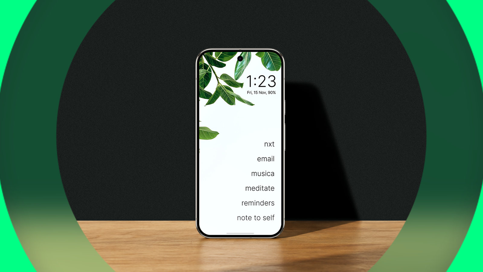
Credit: Lucas Gouveia / Android Police Published Sep 6, 2026, 8:15 AM EDT Marvin is a Features Author for Android Police. His media career began as an editorial assistant at a now-defunct print publication. He has since transitioned to digital media as an editor, attended technology events in over 10 countries, and earned his master's degree in journalism. He enjoys film photography, outdoor running, and alternative coffee brewing during his leisure time. Sign in to your Android Police account I've always preferred minimalist apps. They remove distractions and keep me focused on a single task at a time. It's even better when an app has no ads and lets me customize the interface to my liking. That's how I ended up with Olauncher. It's a minimalist, open source Android launcher that's ad-free and customizable. Best of all, it's free to download from Google Play. Olauncher has been my default launcher for several weeks now. Each day, I find a new reason to make it a mainstay on all my Android devices. Olauncher highlights my most important apps and hides the rest The customization is as straightforward as the launcher There are several minimalist launchers to download on the Play Store, but Olauncher stood out to me for its no-fuss approach to customization and handling apps. When I installed Olauncher, it looked almost too bare. It started off with a black background and only four app shortcuts on the home screen. After I opened the settings menu, I began tinkering to get the interface I wanted. All app icons are gone. Instead, everything is text-based. You can rename each app to specify its purpose. For instance, you can call Waze or Google Maps "Navigation." You could name Firefox or Chrome "Browser." You can align the home screen shortcuts to the left, center, or right. I have eight app shortcuts on the home screen. I also enabled the date and time to display at the top. If you care about your screen-on time, add that to the home screen. Finally, you can turn off the notification bar if you don't want nagging alerts. If you get bored with the all-black theme, turn on the Daily New Wallpaper option to apply a new background each day. From my experience, these wallpapers are randomized and aren't dark-theme friendly. To remove the current wallpaper and go back to a black background, hold the on/off option beside Daily New Wallpaper in the main settings menu. I was pleasantly surprised by the gesture control. I can open two apps by swiping left or right from the home screen. However, you can't add widgets. It's an unfortunate omission for productivity, but it adds to the launcher's minimalism. Swiping down from the home screen reveals the notifications and quick settings panel. I don't have to reach all the way to the top of my phone's display to bring it down. This is the only way to check unread notifications while my notification bar is hidden. Swiping up unveils the text-only app drawer. My keyboard automatically pops up to help search for the app I'm looking for. I don't have to type the entire name or press enter to access them. For example, it's enough to type "Air" to open my Airbnb app. Every tap and swipe now feels intentional I no longer linger on my phone for too long Every action requires a conscious effort on Olauncher. I don't find myself on a random Threads post and wonder how I got here. My home screen is designed to show me the essentials. Typing an app's name instead of scrolling through icons keeps me from looking at other apps that would otherwise distract me. It helps that I can rename apps to generic designations, like "Music" or "Notes." More importantly, I can hide apps from the drawer. This is more intuitive than uninstalling disruptive apps. This method also cuts down on scrolling while looking through my app list. To bring back a hidden app, tap the large Olauncher text at the top of the main settings menu. My setup lets me access my important apps with a single tap or swipe. I tap to open any of my eight home screen apps; I swipe from the left or right to open my news or notes app. Everything else requires several taps on my keyboard to access. Adding more steps may sound unintuitive, but it makes every action feel intentional. I have to navigate a little more to reach an app like Reddit or Instagram. There were days when I'd forget to check Reddit because it felt so inaccessible compared to my productivity apps. I noticed a drop in social media usage after installing Olauncher. My Digital Wellbeing and battery usage stats exposed how my productivity apps took up a larger chunk of my screen time. Tapping the digital clock or date on the home screen brings you to the clock or calendar app, respectively. Tapping the screen time indicator takes you to the Digital Wellbeing app. This minimalist launcher gave me a lot more than I bargained for Olauncher has a paid version with additional features such as a separate page for widgets and app grouping. It also includes a built-in note-taking feature and more wallpaper variety. None of these added features appeal to me, and I'd rather stick to the free version with fewer distractions. I initially tried Olauncher to increase my productivity and eliminate interruptions. Now, I'm keeping this minimalist launcher for its ease of use and appealing aesthetic.
This open source Android launcher made me forget how to use my phone's worst distractions
Full Article
Original Source
Read the full article at Androidpolice →KhanList aggregates and links to publicly available news content. We do not host full articles from third-party sources. Always verify important information with original sources.