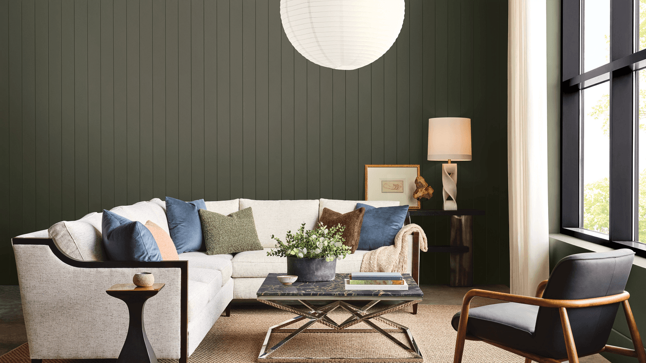
Paint is said to be the easiest way to inject color into a room—a low-commitment alternative to changing tile or upholstery. But as anyone who’s stared at a wall of swatches well knows, choosing the right shade can feel paralyzing. No wonder we so often default to safe, creams and beiges.Emily Kantz, interior designer and color strategist at Sherwin-Williams, understands the uncertainty that comes with landing on a shade, but she and her team also know that people are ready to take risks. That’s why the brand’s Colormix 2027 Trend Forecast features plenty of vibrant moments mixed among more approachable shades.“While previous forecasts explored ideas of comfort, balance, and connection, this year’s forecast embraces greater confidence through color, texture, and unexpected combinations,” Kantz says. “We’re seeing people create spaces that tell a story about who they are and how they want to live.”Humorous Green on laundry room cabinets Courtesy of Sherwin-WilliamsThe kaleidoscopic collection of 48 shades ranges from bold, like the almost fluorescent Humorous Green and playful Forward Fuchsia, to serene, such as Honorable Blue and Secret Garden. Neutrals are still scattered throughout, and 10 adjoining continuity colors complete a fully cohesive palette. In other words, design enthusiasts should think of the forecast as a chance to throw caution to the wind, but still make use of a guardrail set by the pros.“Color influences mood, shapes our experiences, and helps create meaningful connections to the places we spend the most time,” Kantz says. “Colormix 2027 is an invitation to embrace that potential and to design with intention, creativity, and confidence.” Here’s how you can make the most out of Sherwin-Williams Colormix Trend Forecast 2027.Introduce richer shadesMidnight on the walls; Real Red on the bed frame Courtesy of Sherwin-WilliamsThis forecast looks toward the future, but traditional rooms will never go out of style. The right paint colors will only heighten that feeling of established comfort—like Midnight, a deep plum, and Salty Dog, a navy tone. For those who are more accustomed to lighter neutrals, Kantz recommends starting with a small dose.“One of the easiest ways to introduce richer color is by treating it as an accent that complements the neutrals you already love,” she says. “Whether it's a painted island or built-in shelving, these moments can add depth without feeling overwhelming.” Over time, you’ll likely gain the confidence to be more daring, such as color-drenching a dining room in another Colormix rich pick, Roycroft Bronze Green.Embrace the tension of contrasting colorsLotus Petal on the walls Courtesy of Sherwin-WilliamsOne of the most exciting details of the forecast, Kantz notes, is the pairing of grounded shades with hues that pop. As people look to bring life into their homes—replacing picture-perfect vignettes with relatability—they’re seeking unexpected paint combinations. How about pairing pink Lotus Petal with green Jadite?A dresser painted in Jadite against a wall featuring High Sierra Courtesy of Sherwin-Williams“These work because they reflect how people are decorating today,” says Kantz. “They're layering colors, materials, and finishes to create spaces with personality. The result feels curated, expressive, and uniquely intimate.”Use color to foster joyDutch Tile Blue on the walls Courtesy of Sherwin-WilliamsNeutrals help cultivate a sense of calm in a home, but these days, Kantz and the team have noticed that many people want their homes to inspire joy. Therefore, the forecast’s collection includes plenty of colors that feel nostalgic yet invigorating, like Real Red, a mustard yellow called Trinket, and Dutch Tile Blue.“We want to give people the confidence to see color as an opportunity rather than a design risk,” Kantz says. “Paint remains one of the most accessible ways to transform a space, and thoughtful color choices can completely shift how a home looks and feels.”
The Sherwin-Williams Colormix 2027 Forecast Is Made for Nostalgia-Fueled Experimenting
Full Article
Original Source
Read the full article at Architecturaldigest →KhanList aggregates and links to publicly available news content. We do not host full articles from third-party sources. Always verify important information with original sources.