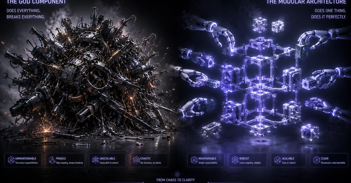
The "God Component" Anti-Pattern When building SaaS interfaces at Smart Tech Devs, developers frequently fall into a dangerous architectural trap when creating reusable UI elements, such as a . Initially, the card just needs a title and some text. But soon, the design team asks for an optional button. Then they want an optional icon. Then a subtitle. Then a loading state. The junior developer accommodates this by adding a new prop for every single request: . This results in a massive, fragile "God Component" that requires 20 different boolean flags to render correctly. If you need a card with a dropdown menu instead of a button, the entire component breaks. To build truly scalable, indestructible design systems, you must utilize Inversion of Control via Component Composition. The Solution: React children Slots Inversion of Control simply means moving the rendering responsibility out of the component and handing it back to the developer using it. Instead of trying to predict every possible permutation of a Dashboard Card via props, the card should only define the structural layout (the padding, the borders, the CSS grid). It then exposes "slots" (using React's children prop) where the consuming developer can inject whatever custom logic they want. Architecting the Modular Wrapper We strip the God Component of all its complex props. It becomes a clean, elegant layout wrapper. // components/ui/DashboardCard.tsx import React, { ReactNode } from 'react'; interface DashboardCardProps { title: string; // ✅ THE ENTERPRISE PATTERN: We use slots instead of rigid props headerAction?: ReactNode; children: ReactNode; } export default function DashboardCard({ title, headerAction, children }: DashboardCardProps) { return ( {title} {/* We don't care if this is a button, a dropdown, or a loading spinner. We just render whatever the parent provides! */} {headerAction && {headerAction}} {children} ); } Consuming the Composed Architecture Now, the UI developer has absolute freedom. They can build a simple text card, or an incredibly complex interactive chart card, all using the exact same underlying structure without adding a single new prop to the core library. // app/dashboard/page.tsx "use client"; import DashboardCard from '@/components/ui/DashboardCard'; import { ExportButton, SettingsDropdown, SalesChart } from '@/components/features'; export default function DashboardPage() { return ( {/* Variation 1: A complex card with a dropdown menu in the header */} } > {/* Variation 2: A simple card with a button in the header */} } > 12,450 ); } The Engineering ROI By enforcing Component Composition, you completely eradicate "prop drilling" and bloated God Components. Your UI library becomes infinitely flexible, component files remain under 50 lines of code, and developers can inject radical new features into existing layouts without breaking the underlying design system.
Stop God Components: React Composition Patterns ⚡
Full Article
Original Source
Read the full article at Dev →KhanList aggregates and links to publicly available news content. We do not host full articles from third-party sources. Always verify important information with original sources.