
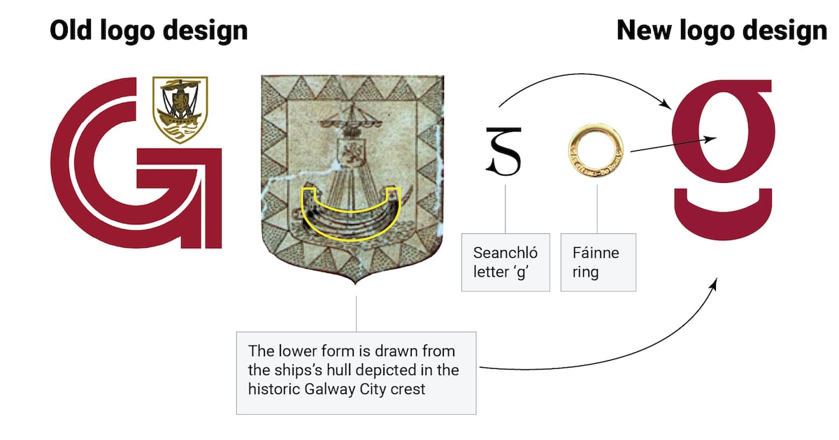
A rebranding effort seeking to refresh the image of Galway City Council has been met with widespread criticism in what has become a public relations nightmare for the local authority. Heralded as the dawn of a new era for the council, the unveiling of a “new visual identity” has been mired by backlash from local politicians, businesspeople and the public. The council restricted comments on its social media posts about the rebranding, but the commentary has been overwhelmingly negative. There have been growing calls for the council to restore its original logo, a distinctive “G” designed in the 1980s by a local man which incorporates the Galway city coat of arms. READ MOREAn organic campaign has emerged online where many social media users have switched their profile photos to the logo that has been replaced. The man leading the charge is publican Fergus McGinn of McGinn’s Hop House in Woodquay. His late father-in-law, Jimmy Conneely, a graphic artist from Bohermore, designed branding for Galway institutions including Faller’s Jewellers, Ó’Máille’s Aran sweater shop and the former Great Southern Hotel. More than 40 years ago, Conneely was commissioned to develop a logo as part of Galway’s quincentennial (500-year) celebrations in 1984. Old Galway logo McGinn said it was “nonsense” to erase the history of that logo with a new design that has been described by many as “no better than something generated by artificial intelligence”. “There’s absolutely no need for a new logo. It’s a total waste of money. That was a beautiful piece of art, with history and culture attached to it. The number of companies that have similar logos to this new logo they have come up with, it’s just sinful,” he said. McGinn said he has been inundated with messages of support from the public and the business community. “Galway doesn’t need a rebrand. We are the envy of the country for our arts, ceol and culture. It’s just nonsense. Businesses are struggling. Services are under pressure. And they decide: ‘We’ll rebrand Galway and we’ll look great.’ Well, they look like a shower of eejits.” In a statement, the council said the new design draws on Galway’s civic and maritime heritage. The lower-case “g” reflects the form of the hull of the ship represented in the city’s coat of arms, while its style also draws on the tradition of seanchló, the historic script used in Irish, it said. New Galway logo Leonard Cleary, chief executive of the council, said the project was about more than changing a logo. “We need to make it easier for people to recognise the role of the council and the services we provide. The new identity is one part of that work, while also reflecting Galway’s civic heritage and the important place of the Irish language in the city,” he said. Richie McCarthy, the council’s head of communications and corporate marketing, said: “The identity draws directly on Galway, including its civic heritage, the river Corrib and the city’s bilingual character.” But Galway councillor Josie Forde, the deputy mayor of Galway, asked: “What’s the point?” “There was no need to rebrand. They tell me Galway is going to be a very different Galway in a few years and it was time to rebrand. But if it’s not broken, don’t fix it,” said the Fianna Fáil politician.Forde said the reported €28,000 cost of the logo design was only the start of the financial outlay, which will include rebranding council flags, vehicles, stationery, bins and signage around the city. [ ‘The forgotten village’: a population of 700, yet 22,000 vehicles pass through it per dayOpens in new window ]“Why not put the money into infrastructure we need? They want us to vote for an increase in [commercial] rates [in the upcoming budget]. They should put that money back into the city instead of rebranding a logo we don’t need,” said Forde. Businessman and Labour councillor Níall McNelis said elected members voted for the rebranding as part of a new communications plan when they passed last year’s budget, but he said: “They’ve made a balls of it.” “At the end of the day, it’s an executive function. They weren’t going to have a logo designed by committee otherwise you’d end up with a camel,” said McNelis.“I’d prefer to discuss the housing crisis, or the traffic situation. This is a pure distraction to what’s going on in this town.”
Splitting the ‘G’ people – Galway City Council’s efforts to rebrand divide and backfire
Full Article
Original Source
Read the full article at Irishtimes →KhanList aggregates and links to publicly available news content. We do not host full articles from third-party sources. Always verify important information with original sources.