
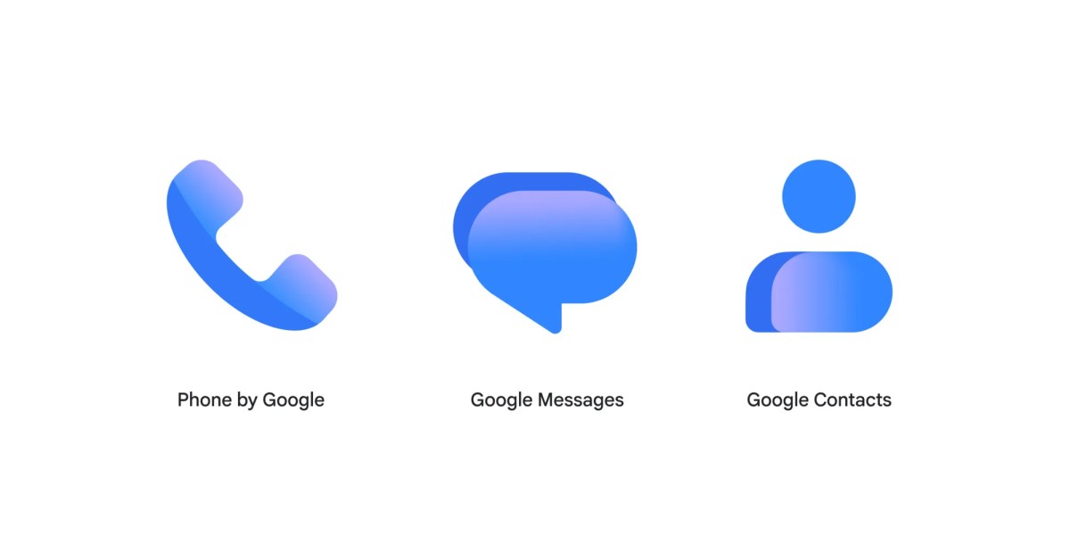
Google this week completed the rollout of its new gradient icons with updates for Messages and Contacts. The icon shapes remain the same for all three communication apps, though they are slightly larger and better fill the circular backgrounds. Contacts is still a head and body, while Messages remains overlapping chat bubbles and Phone a handset. This redesign is not particularly disruptive. A lighter shade of blue is leveraged, while all feature a gradient effect. This results in the logos feeling less heavy and a bit more modern. Google describes the new Messages icon as “sharper, crisper, and clearer than ever before.” The SMS/RCS client did not roll out any other changes with the logo redesign this week. The big homepage redesign is still in the beta channel. Google Contacts was the last Android icon to be refreshed, with version 4.92.26.x rolling out on Wednesday evening. The Phone by Google update rolled out on Monday to stable users. It took two weeks from announcement to full availability across the three apps. FTC: We use income earning auto affiliate links. More.
New gradient icons roll out to Google Messages & Contacts
Full Article
Original Source
Read the full article at 9to5google →KhanList aggregates and links to publicly available news content. We do not host full articles from third-party sources. Always verify important information with original sources.