
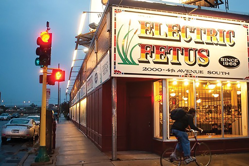
Your store sign is the first thing your customers see. So what makes a great one? We asked some of America’s Favorite Mom & Pop Shops® to explain theirs. By Frances Dodds | Sep 22, 2026 This story appears in the September 2026 issue of Entrepreneur. Subscribe » A store sign is the face of your business, greeting customers the way a person greets friends and strangers. The minute a customer spots your sign, they make conscious and subconscious assessments about your business. Can they expect your business to be rugged and earthy, or clean and modern? Is it no frills, timeless and old-fashioned, or off-beat and funky? Whatever “sign language” you’re speaking, it’s sure to make an impact. Here, nine of the local businesses on our America’s Favorite Mom & Pop list share the thinking behind their signs. 1. Plants with soul. “In the spirit of rasquachismo [or, ‘making the most from the least’], nothing is wasted and everything has soul. Our original sign was hand-painted by a young, local female artist, so it’s a true L.A. artifact. We’ve evolved it over the years, sometimes letting the ghost of the old sign shine through. Because in L.A., signs aren’t just signs. They’re history, art, and resistance.” — Owner Andi Xoch, Latinx with Plants, Los Angeles, California Image Credit: Courtesy of Latinx with Plants 2. Stark sandwiches. “Our building is a small, white brick shop with black accents. We chose a simple sign with clean lines because we wanted the storefront to feel clean, welcoming, and approachable. We also made sure the sign glowed at night, because I loved the idea of someone driving by, seeing it lit up, and thinking, I have to check that place out.” — Co-Owner Staci Puleo, Staci’s Sandwich Joint, Verona, New Jersey Image Credit: Courtesy of Staci’s Sandwich Joint 3. Mortality calls. “We’re an antiques store, so our sign is very descriptive of what we sell: dead people’s stuff, architectural antiquesand design. The logo is inspired by the Mexican tradition, with the skull for Day of the Dead. And the butterfly represents rebirth and new life.” — Owners Curran and Marymar Fudge, Dead People’s Stuff, Oklahoma City, Oklahoma Image Credit: Courtesy of Dead People’s Stuff 4. Leather with history. “Our sign reflects exactly who we are: simple, timeless, and authentic. Our crossed-swords logo, which we’ve had for nearly 40 years, quietly welcomes people to a place where things are still made by hand. Our workshop and store sit in a small town, and our sign is meant to blend into that landscape rather than compete with it.” — Owner Garry A. Littleton, Colonel Littleton, Lynnville, Tennessee Image Credit: Courtesy of Colonel Littleton 6. Historic rebrand. “When I took over, it was the Hublersburg Hotel and Family Tavern, and it had a reputation as a dive bar. So the change to Hublersburg Inn was an effort to rebrand as a respected dining destination. I updated our sign while keeping the federal style, and added ‘Spirited American Cuisine.’ It’s a play on words since we serve upscale American food and the Inn is definitely haunted!” — Owner Andi Heidt, Hublersburg Inn, Hublersburg, Pennsylvania Image Credit: Courtesy of Hublersburg Inn 7. Memorably weird. “The first thing people usually notice is the name. Long ago, National Lampoon magazine singled the store out for having the worst name for a business. Be that as it may, it’s a name people don’t forget. The vibe of our sign is vintage curiosity. We had a sign-maker do it by hand many years ago, and have had it refreshed, but kept it exactly the same. Fans of the store are often seen taking selfies in front of the sign!” — Owners Stephanie andAaron Meyerring, Electric Fetus,Minneapolis, Minnesota Image Credit: Courtesy of Electric Fetus 8. Magical sparkle. “We updated our craft shop’s logo three years ago, when we moved to a new location. We wanted it to feel whimsical, creative, and kick-ass, and we wanted a big side of magical. It’s why we added as much literal sparkle as possible.” — Owner Ashley Morken, Unglued, Fargo, North Dakota Image Credit: Courtesy of Unglued 9. Old name, reimagined. “We inherited the name Gadzooks, so the challenge was to honor the 34-year history of the business while refreshing it. We chose a font that denoted ‘open and friendly,’ with a high, thin sans-serif for sophistication. We kept the ‘g’ lower case for less formality and used American Typewriter for ‘salon’ because it’s old-school and trustworthy.” — Owners Kim and Scott Myles, Gadzooks Salon,Bethlehem, Pennsylvania Image Credit: Courtesy of Gadzooks Salon A store sign is the face of your business, greeting customers the way a person greets friends and strangers. The minute a customer spots your sign, they make conscious and subconscious assessments about your business. Can they expect your business to be rugged and earthy, or clean and modern? Is it no frills, timeless and old-fashioned, or off-beat and funky? Whatever “sign language” you’re speaking, it’s sure to make an impact. Here, nine of the local businesses on our America’s Favorite Mom & Pop list share the thinking behind their signs. 1. Plants with soul. “In the spirit of rasquachismo [or, ‘making the most from the least’], nothing is wasted and everything has soul. Our original sign was hand-painted by a young, local female artist, so it’s a true L.A. artifact. We’ve evolved it over the years, sometimes letting the ghost of the old sign shine through. Because in L.A., signs aren’t just signs. They’re history, art, and resistance.” — Owner Andi Xoch, Latinx with Plants, Los Angeles, California Image Credit: Courtesy of Latinx with Plants 2. Stark sandwiches. “Our building is a small, white brick shop with black accents. We chose a simple sign with clean lines because we wanted the storefront to feel clean, welcoming, and approachable. We also made sure the sign glowed at night, because I loved the idea of someone driving by, seeing it lit up, and thinking, I have to check that place out.” — Co-Owner Staci Puleo, Staci’s Sandwich Joint, Verona, New Jersey Image Credit: Courtesy of Staci’s Sandwich Joint 3. Mortality calls. “We’re an antiques store, so our sign is very descriptive of what we sell: dead people’s stuff, architectural antiquesand design. The logo is inspired by the Mexican tradition, with the skull for Day of the Dead. And the butterfly represents rebirth and new life.” — Owners Curran and Marymar Fudge, Dead People’s Stuff, Oklahoma City, Oklahoma Image Credit: Courtesy of Dead People’s Stuff 4. Leather with history. “Our sign reflects exactly who we are: simple, timeless, and authentic. Our crossed-swords logo, which we’ve had for nearly 40 years, quietly welcomes people to a place where things are still made by hand. Our workshop and store sit in a small town, and our sign is meant to blend into that landscape rather than compete with it.” — Owner Garry A. Littleton, Colonel Littleton, Lynnville, Tennessee Image Credit: Courtesy of Colonel Littleton 6. Historic rebrand. “When I took over, it was the Hublersburg Hotel and Family Tavern, and it had a reputation as a dive bar. So the change to Hublersburg Inn was an effort to rebrand as a respected dining destination. I updated our sign while keeping the federal style, and added ‘Spirited American Cuisine.’ It’s a play on words since we serve upscale American food and the Inn is definitely haunted!” — Owner Andi Heidt, Hublersburg Inn, Hublersburg, Pennsylvania Image Credit: Courtesy of Hublersburg Inn 7. Memorably weird. “The first thing people usually notice is the name. Long ago, National Lampoon magazine singled the store out for having the worst name for a business. Be that as it may, it’s a name people don’t forget. The vibe of our sign is vintage curiosity. We had a sign-maker do it by hand many years ago, and have had it refreshed, but kept it exactly the same. Fans of the store are often seen taking selfies in front of the sign!” — Owners Stephanie andAaron Meyerring, Electric Fetus,Minneapolis, Minnesota Image Credit: Courtesy of Electric Fetus 8. Magical sparkle. “We updated our craft shop’s logo three years ago, when we moved to a new location. We wanted it to feel whimsical, creative, and kick-ass, and we wanted a big side of magical. It’s why we added as much literal sparkle as possible.” — Owner Ashley Morken, Unglued, Fargo, North Dakota Image Credit: Courtesy of Unglued 9. Old name, reimagined. “We inherited the name Gadzooks, so the challenge was to honor the 34-year history of the business while refreshing it. We chose a font that denoted ‘open and friendly,’ with a high, thin sans-serif for sophistication. We kept the ‘g’ lower case for less formality and used American Typewriter for ‘salon’ because it’s old-school and trustworthy.” — Owners Kim and Scott Myles, Gadzooks Salon,Bethlehem, Pennsylvania Image Credit: Courtesy of Gadzooks Salon Frances Dodds is Entrepreneur magazine's deputy editor. Before that she was features director for Entrepreneur.com,... Read more Related Content
National Lampoon Said This Store Had the ‘Worst Name’ for a Business. Here’s How to Create a Sign Customers Won’t Forget.
Full Article
Original Source
Read the full article at Entrepreneur →KhanList aggregates and links to publicly available news content. We do not host full articles from third-party sources. Always verify important information with original sources.