
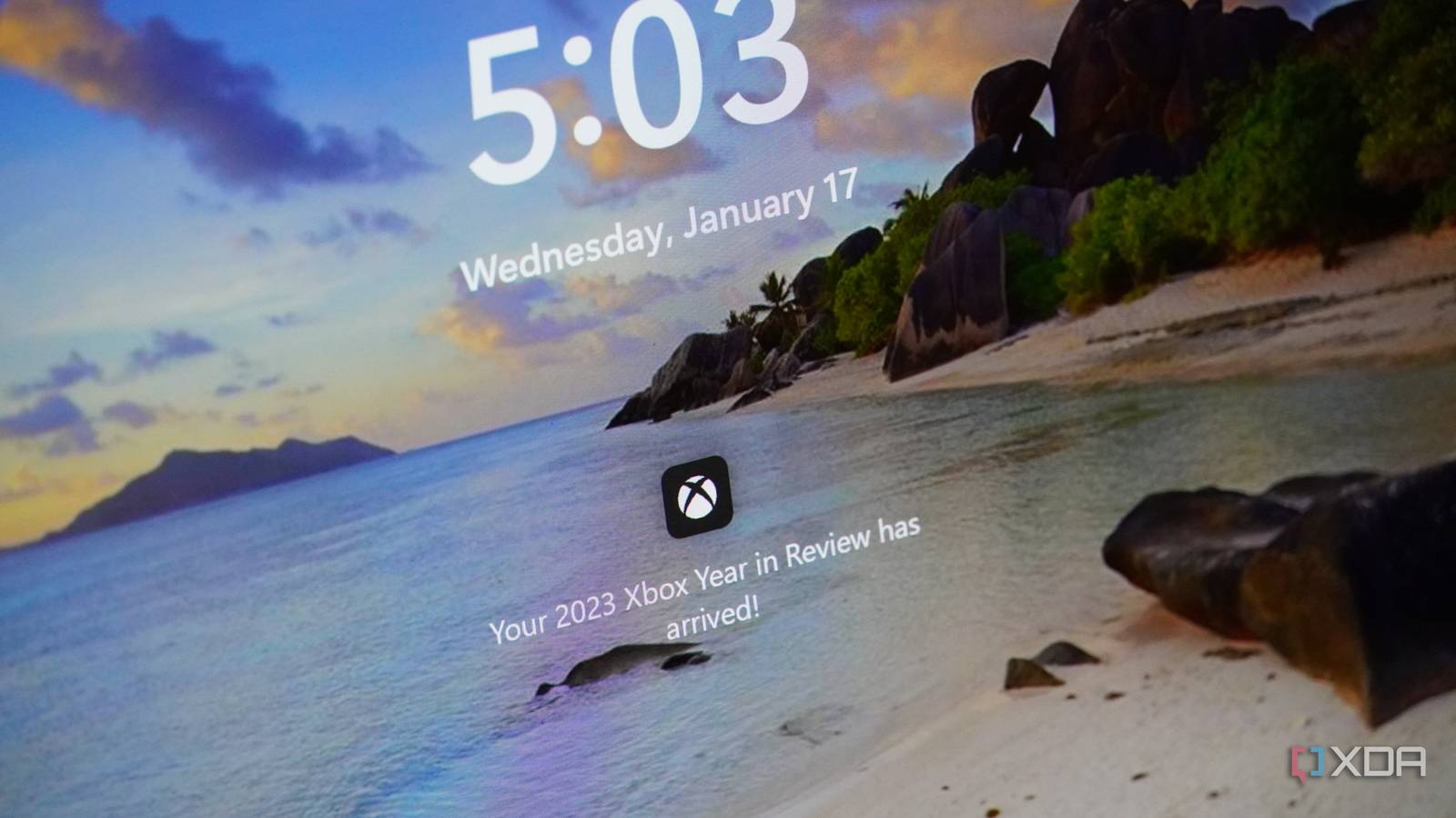
Published Sep 18, 2026, 2:04 AM EDT Simon is a Computer Science BSc graduate who has been writing about technology since 2014, and using Windows machines since 3.1. After working for an indie game studio and acting as the family's go-to technician for all computer issues, he found his passion for writing and decided to use his skill set to write about all things tech. Since beginning his writing career, he has written for many different publications such as WorldStart, Listverse, and MakeTechEasier. However, after finding his home at MakeUseOf in February 2019, he would eventually move on to its sister site, XDA, to bring the latest and greatest in Windows, Linux, and DIY electronics. Sign in to your XDA account Summary Microsoft trims Windows 11 lock screen to bare essentials, removing the default widget clutter. Lock screen now shows clock, date, and local weather, letting the background shine through. This tweak appears to be part of Windows K2 effort to roll back unwanted features and improve customization. If you're someone who appreciates minimalism, you're probably not a huge fan of what Windows 11's lock screen looks like before you customize it. By default, it comes with a selection of widgets that not everyone may appreciate, which you need to manually turn off. Fortunately, it seems that Microsoft has gotten the memo, as it has seemingly reduced what appears on the lock screen to just the bare essentials. Microsoft is reportedly reducing what the Windows 11 lock screen shows by default Things seem to be a lot cleaner now As spotted by Windows Latest, Microsoft has apparently tweaked what the default Windows 11 lock screen looks like. Beforehand, the lock screen came chock full with widgets, including Weather, Sports, Money, and whatever else the company wanted to push from its MSN branch. Well, Windows Latest is reporting that its Windows 11 lock screen is now a lot quieter than it was before. The example they showed is very simple. There's the clock and date at the top, the local weather at the bottom, and that's it. The rest of the screen real estate is dedicated to letting the lock screen background shine through, which makes everything look very tidy and professional. This is likely a part of an internal Microsoft initiative called Windows K2 that began around early 2026. It sounds like a new version of Windows at first, but it's actually a plan to tweak some of the biggest pain points people have with Windows 11. We've already seen sweeping changes, such as rolling back Copilot from Windows 11's core apps and redesigning the Start menu to allow for better customization. Here's hoping Microsoft keeps the momentum up; things are looking very promising already.
Microsoft is finally making the default Windows 11 lock screen a lot less cluttered
Full Article
Original Source
Read the full article at Xda-developers →KhanList aggregates and links to publicly available news content. We do not host full articles from third-party sources. Always verify important information with original sources.