
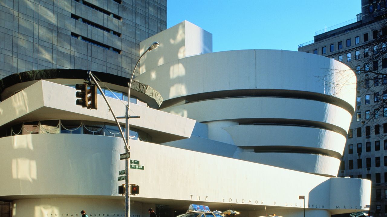
In this excerpt from her forthcoming book A Dead White: An Argument Against White Paint, writer Wendy S. Walters looks back on the architect’s crusade against the shade he called “a devastating color”The Guggenheim museum in New York CityPhoto: John Lamb / Getty ImagesFrank Lloyd Wright, the architect of the Guggenheim Museum, hated white paint. In March of 1958, Wright, who was ninety years old, made this a point of contention between himself and James Johnson Sweeney, the museum’s new director. Sweeney wanted only his office in the new building to be painted white, initially. But soon after that matter had been settled, he began to envision all the exhibition spaces being painted in the same fashion. On March 17, Wright composed a memo about this to Harry Guggenheim, who was managing the building’s construction. He implored Harry to change Sweeney’s mind about using white paint:White—a devastating color under daylight—is the sum of all colors. Even used as a frame of reference for paintings (to say nothing of sculpture), it is a makeshift or a menace. Here by intention (and bequest) we have a great work of sculptural architecture calculated to set up a picture in the atmosphere of a harmonious series of daylighted-forms. This setting is new and may stimulate a new impulse in the art of painting whereas the old cliché of a white shroud for the painting seen by gaslight may in future well be called not only, the “grave of modern art” but now the destruction of a great building.Wright was known to be arrogant, and his self-importance is on full display here. He certainly was not known for being compromising, and he was clearly frustrated about losing control over some aspects of the museum’s completion. Wright was confident that his building was so important that it would likely inspire a new movement in painting—even as he knew that it had been made to exhibit several concurrent “new movements” in painting. But I don’t think that’s all that is going on here.In his letter to Guggenheim, Wright claims white paint is “devastating,” suggesting that it brings damages. He also calls it “makeshift,” implying that it is crudely fashioned for the sake of expediency. He says that using white paint would transform the building into a shroud—which is used to wrap the dead prior to burial—for the display of art. He adds that white paint is a “menace,” something that threatens the building’s progress or success. He insists that white paint is a “grave” maker, because of its ability to destroy the building outright. In Wright’s analogy, the building is alive, and white paint is a killer. While his rhetoric is a bit over the top, it also reveals the intensity of Wright’s objections. Beyond that, they disclose his way of thinking about white paint, which was vigilant. It seemed apparent to me that Wright was not just being dramatic in his condemnation of white paint. He saw a real risk in it.On April 3, Wright wrote to Guggenheim again, this time imploring that “White is a color—the loudest color of them all. A true artist would not paint for a white background which nature seems to use most sparingly for accent only.” With this bitter note of emphasis, Wright was taking a jab at both Sweeney and the artwork he hoped to exhibit. He ended the letter with another mortal analogy, comparing a white-painted room to a tomb, to point out the absurdity of Sweeney’s choice: “Human sepulchre is white. Why?”But Wright’s passionate letters did not change Guggenheim (or Sweeney’s) mind. In May of 1958, he tried a new tactic. He wrote to Aline Saarinen, the architecture critic who had previously written a positive profile of Wright. This note opens with the cry “S.O.S!” before outlining the cause of the emergency. Wright implored her to help him: “A picture-hanger named Sweeney is authorized by the trustees—Harry Guggenheim, Chairman, to barge in on the architect of the museum and paint the interior dead-white—thus tearing the inside from the outer walls of the organic building.” He asked her to “get into [her] fighting clothes” and try to change the mind of the museum’s trustees.“Dead-white” was a commonly used name for paints that were very white. “Dead” implied the colorlessness of this hue, evidenced by its brightness. A dead-white paint was a white paint without a mitigating undertone. It looked final and absolute—pure. That name for it, “dead-white,” was also a play on “white-lead,” a pure pigment, which could be ground into a fine powder and mixed with oil to create a uniquely bright, opaque white paint. Whitelead in paints was valued for its opacity and ability to form a smooth finish wherever it was applied. But creating the paint was risky.Lead paints are toxic. Since the late nineteenth century, raw white-lead was known to pose a substantial health risk to those exposed to it, prompting symptoms such as swelling of the brain, epileptic convulsions, paralysis, severe colic, and death. In England, workers in paint factories, especially those of the poorer classes, were paid an extra shilling per week to compensate for the additional risk they took in working with it.From 1883 to 1885, the diagnosis of lead poisoning from white-lead was made so often among hospital patients at the Shoreditch Infirmary on the East End of London that its doctors wrote The British Medical Journal to warn other practitioners about it. In a letter, they claimed that white-lead posed a risk to public health and cited workers who suffered from “the recklessness, the poverty, and the submissive ignorance of the classes who consent to undertake work fatal to their health, and often productive of early death in its most miserable forms, at so wretched a pittance in addition to their ordinary wage.” But instead of denouncing the class of managers and industrialists who profited from the paint factories, the doctors blamed the workers for their poor condition, citing their dedication to their jobs as its primary cause.In these paint factories, young women performed the most perilous work, managing the production of pure white-lead that would later be combined with oils. As they carried large vessels of this noxious material in liquid form, it would splash onto them and harden. Most of these laborers did not have multiple garments, so as they worked, their clothes would collect the spillage at an alarming rate: “their dresses soon become saturated with the white-lead, dry or wet; and if, as in two or three, perhaps, of the best regulated factories, a change of clothes be insisted on, enough of the dust enters their mouths and noses, and is swallowed with saliva, to produce effects equally grave.” I imagined these women moving through the city in their stiff white dresses, clouds of delicate white dust in their wake. The severity of their exposure was corroborated by the short life of cats, who feasted on the factory’s omnipresent rodents. The felines, who cleaned themselves frequently, provoked a saying in the factories: “It is impossible to keep a cat, they always die of lead poisoning here.” Rats, however, seemed immune and thrived in these locations.There were an ocean and half a century between those paint factories in London and the Guggenheim Museum, which had its origins in a private gallery called the Museum of Non-Objective Painting. Founded in 1939 by Solomon R. Guggenheim, a New York mining magnate and avid collector of art of the moment, the Museum of Non-Objective Painting aimed to cultivate the public’s appreciation for paintings that embraced geometrical abstractions over naturalistic images. Since its founding, Guggenheim’s private collection had been on public display here, in a gallery at East 54th Street, under the direction of the German-born artist Hilla Rebay, who met Guggenheim when she was commissioned to paint his portrait. Rebay introduced him to a number of artists whose work was highly abstract, and she facilitated his relationship with them as he sought to build on his collection.Rebay’s designs for the Museum of Non-Objective Painting looked otherworldly. Fabric-draped walls served as the backdrop for paintings encased in large ornate frames that rested on low easels or the floor. The space was considered quite unusual, to the point of being called “theatrical” in an early review by The New York Times. This criticism did not seem to bother Rebay, whose grand ambitions were spelled out in a foreword to one of the exhibitions:The eyesight of many has progressed from earthly observation to cosmic vision—from a practical, useful, intellectual information exchange into a medium for the intuitive capacity to receive spiritual joy, receptive to the influence and visual expression of cosmic power.Rebay’s insistence that this new moment in art reflected a “cosmic” calling signaled her celestial aspirations. It also reveals her unusual perspective on art, seeing it not just as an affirmation of the taste of the individual but as a medium for spiritual transportation.In 1943, Guggenheim contracted Wright to begin plans for a new building to showcase his growing fine art collection. The planning process was extensive, and it was difficult to secure a site that could accommodate the project’s full ambitions. No ground had been broken when Guggenheim died in 1949. But the project continued. Guggenheim’s nephew, Harry, a former ambassador to Cuba, took over the next phase of its development. This also involved dealing with Wright’s architectural sensibility. For Wright, an ideal building should synthesize the elements that surrounded it and look as if it had naturally grown out of the site on which it stands. He believed it should express a unified design, one with open spaces that were carved out of an obvious and often repeated form. He liked to use natural colors, ones that were inherently connected to the landscape.For the museum, in particular, it was most important to him that the inside of the spiral looked the same as it did from the outside. And because of this, he insisted that both its interior and exterior be painted in the same color.The construction of the museum took nearly a decade. During that time, Harry Guggenheim managed Wright’s ego, mercurial temperament, and expensive imagination with great patience. In 1952, Rebay retired, and Sweeney was appointed director of the still unfinished galleries. Sweeney had his own vision for what a museum could do in the postwar moment, which aligned with his ambitions for the growing collection. He shifted the curatorial mandate from its narrow focus on “nonobjective art” to include representational painting—works that showcased true people and things. In addition, he championed the collection of modern and contemporary works by American and European artists that were varied in style. He acquired sculptural pieces, as well. To make a suitable backdrop for all these works, Sweeney proposed that the interior of the museum be painted in a bright white paint, the very paint that Wright would refer to pejoratively as a “dead-white.”Sweeney was more than thirty years younger than the architect, but Wright had him pegged as a traditionalist whose yen for “dead-white on the walls”—was “his special contribution to the old order.” While Wright had strong feelings about Sweeney’s taste in paint, Sweeney was, likewise, not a fan of Wright. He rightly believed that the architect was more focused on his own design than the artworks the building was supposed to provide a home to. The museum’s floor plan, especially its curved walls, presented previously unheard-of challenges for exhibiting artworks. Rebay had suggested covering the walls of the galleries in fabric, as they had been at the Museum of Non-Objective Painting, but Sweeney disliked her suggestion, too. His primary ambition was to direct the audience’s attention to the artworks. He believed that a white interior would help to keep their eyes focused on the exhibitions rather than on the building that contained them.There was another obstacle that Sweeney faced in bringing the museum together. In a speech delivered at the Northeastern Museums Conference in November of 1958, he shared the challenges its interior walls created for exhibiting paintings along the spiral’s incline galleries. Many of the works he hoped to show had been previously displayed in gilded, heavy frames. Given the hardness of the wall surfaces and unique sloping design, mounting larger frames would be difficult, possibly even disastrous. Sweeney also thought that ornate style of display was outmoded and might look odd with some of the more delicately composed modern and contemporary works. The cost of building new frames was beyond the limitations of his budget, so with an eye to economy, he decided to remove the artworks’ frames altogether and exhibit the works, simply, against a plain white background.The outside of the museum was painted per Wright’s color specifications in an earthy and soft tan. But inside, Sweeney’s vision triumphed over Wright’s, who, despite many passionate memos, was unable to convince Harry to interfere. Guggenheim believed the interior of the museum was rightly within Sweeney’s purview, just as its exterior color was within Wright’s. It’s not clear how long tensions between Wright and Sweeney persisted, but in a memo to Sweeney from Orrin Reilly, founder of the conservation department, dated April 3, 1959, six months before the museum opened, Reilly noted that “Now the walls are painted and finished before hanging.” Less than a week later, Wright died suddenly in Arizona, from complications after a surgery.The conflict between Wright and Sweeney over the museum’s interior came to an end, but without the satisfaction of a resolution that resembled a shared perspective. They both felt that big things were at stake in the choice of paint colors, even as they disagreed about the most important feature of the new museum. Wright wanted people to be able to see the building’s contours in natural and electric light, so he suggested painting the interior in ivory. Sweeney wanted to draw people’s attention to the artworks, so he insisted on painting the walls in a dead-white. At first, it seemed to me that there was not much of a variation between their preferences, but taking a closer look helped me to understand how they differ. Ivory has a warm undertone, often of yellow but sometimes of pink or brown, while a dead-white has a cool undertone, lightly inflected with gray or blue. Ivory reflects a mixed composition, while a dead-white is meant to appear “pure,” even when it is not. Ivory responds to light with a softer tone than a dead-white, which is aggressively reflective.A tension between the two men arose out of this extremely subtle contrast, as a matter of nuance. But nuance is tricky. A whole worldview can turn on it. Patience and focus are necessary to recognize it. Once seen, nuance may still be easy to ignore, even if it is clear that doing so increases the risk of error. An accidental double touch on a penalty kick might mean the loss of a football game. If I underestimate my bill by one cent, it might lead to a default on my account due to underpayment. The difference between one driver successfully passing another on the freeway is sometimes just a matter of a few inches. In creative fields like visual art or language, the impact of nuance can be harder to measure than it is with numbers. But it delivers its consequences, nonetheless. Nuance counts the most when the stakes are high. And sometimes, it can be hard to see how high the stakes are if one is in the habit of ignoring them. Both Wright and Sweeney understood this, even if they were not aligned in their point of view.During the period that conversations about the museum’s interior advanced, Wright and Sweeney disagreed about ivory vs. white paint, options that from each of their own perspectives were miles apart. But why were they at such odds? Ivory paint absorbs some of the light’s reflection, a small amount to be sure, but enough to soften the light’s expression. A dead-white paint is intentionally reflective, causing more light to bounce off the surface and back into the room. Perhaps the biggest point of difference between the two men was their preferred source of illumination. Wright wanted the inside of the building to be bathed in natural light. To make this possible, he had installed the Oculus. Sweeney preferred electric light, which was more easily controlled. Put simply: Wright wanted the galleries to be lit, at least in part, by the contours of the building, while Sweeney hoped to rely on technology.Not all of Wright’s suggestions for painting the museum were so subtle. He initially proposed a deep pink-orange color called Cherokee Red for the exterior. He had used the bright color before, most notably as an accent for Fallingwater, a house he designed for the Kaufmann family in the highlands of southwestern Pennsylvania. Erected on a hillside in 1938, Fallingwater appeared as a matrix of rectangles with low and flat horizontal lines stretching across the planes of the house. A Guggenheim painted in Cherokee Red would have referenced one of his most famous works. In a time when pale, old-line colors were on trend, an intense hue might have drawn attention, including controversy, to the building. Wright did not fear this kind of notoriety. The Guggenheim commission was a career milestone, and he hoped it would affirm his eminence as “the American”—meaning not European—architect. But there was a downside to using a bold color. It could draw attention away from the Guggenheim’s spiral, the feature that was most important to Wright. So, he agreed to paint the exterior in an understated neutral, a more conservative choice. This concession did not mean that Wright was old-fashioned or averse to using new technologies or materials—in fact, he championed this kind of innovation. In 1957, Wright decided to use a state-of-the-art compound to seal the concrete facade, made of a material called gunite. On top of these multiple layers of concrete, the contractors applied Hollingshead Cocoon, an advanced latex and vinyl plastic coating system, which allowed the structure to appear seamless. Cocoon came in its own limited palette of twenty-five colors, and in July 1958, Wright approved “Buff” as the exterior’s topcoat. The museum would remain this color for about five years.When the Guggenheim Museum opened on October 21, 1959, John Canaday, a critic for The New York Times, described the building as a war between architecture and painting, one in which “both come out badly maimed.” The museum’s unusual structure was mocked—as it had been during its construction. It was even called a “hot cross bun” and a “washing machine” pejoratively by fellow New Yorkers. The interior drew its own grim commentary—a few guests expressed feeling a sudden compulsion to jump from the top of the spiral ramp to their death. Even Hilla Rebay was not impressed. But she was most perturbed about Sweeney’s first exhibition, called Inaugural Selection, which she believed had made a mockery of Solomon Guggenheim’s vision and legacy. These jokes and jabs provoked the public’s curiosity, and they came to see what the fuss was about for themselves. Over the next decade, the museum gained in public prominence and critical standing. Soon it was revered for both its architecture and collections. But not long after the Guggenheim opened, Sweeney had had enough. In 1961, he left New York for Houston, where he became the director of the Museum of Fine Arts.Shortly before his departure, Sweeney published an essay that reaffirmed his curatorial convictions. The article, called “New Directions in Painting,” aimed to convince audiences to be more receptive to contemporary art. It attempted to quell the anxiety of those who felt overwhelmed by the constant change “in the living art of today.” Sweeney explained how the vision of the artist must adapt to the times. He made his case through the example of poetry, particularly the writings of William Wordsworth and T. S. Eliot. Sweeney was writing about visual art, but he used verse as the criterion, because at the time, there was more enthusiasm for the creative turns that literature might take. He argued that audiences should encourage painters and sculptors to experiment in ways that were responsive to the world. Art should not reflect a static vision, one that was only beholden to the past. To experience the discomfort of “the new” was a necessary step in advancing as a society.Perhaps most importantly, Sweeney implored people to understand that painting is a matter of communication. He called it a language of expression, which, like writing, had the capacity to reveal an entire world, even if that world is not immediately recognizable to the viewer. He wrote, “a painting, like any other true work of art, is essentially a metaphor of structure.” Sweeney was referring to the way a painting makes space. It draws our attention as a tactile expression of the painter’s impulses and imagination, but it also exists as a series of physical contours and textures. Given this, a painting demonstrates at least two systems of organization at once—a system of ideas and a system of materials.In 1992, following the museum’s restoration and expansive addition of a ten-story tower, its exterior was repainted in a whitish gray, which blended in with the light-colored stone buildings near it along Fifth Avenue. In 2007, the exterior color was once again a subject of controversy. After much debate by the New York City Landmarks Preservation Commission, proponents for restoring the building to Wright’s preferred color, that yellowish beige called “Buff,” failed to persuade the committee, which decided that the museum would keep its pale hue, Tnemec BF72 Platinum. During the process of repainting, conservators discovered that there were, in fact, eleven layers of paint on the outside. It appeared that lighter and lighter paints had been applied to its exterior with each repainting. This meant that the interior and exterior colors of the museum were now much more similar than they had been when the museum opened. In some ways, Wright’s vision of a unified space had finally been achieved. But it’s likely that he still would have been displeased, given how much the interior and exterior paints resemble a dead-white.I say “resemble” because, technically, the exterior of the museum is a very pale gray. It turns out that what I saw that day as white was a phenomenon of perception that occurs with natural light. It was also a matter of physics. As the sun’s UV rays hit the surface of the building, they attack the molecules responsible for color in the pigment—the chromophores—which can make a surface fade from the paint’s original color. Sunlight fundamentally changes the chromophores’ ability to express color. Over time, the paint’s pigment becomes permanently damaged. One can see this when a paint’s color appears diminished and faded. To put it simply: As I faced the white building, I was, in fact, looking at a dying gray.Excerpted from A Dead White: An Argument Against White Paint. Copyright © 2026 by Wendy S. Walters. Reprinted by permission of Scribner, an imprint of Simon & Schuster, LLC.Not a subscriber? Join AD for print and digital access now.Sign up for our daily newsletter to get the best of design in your inbox.Read MoreTo Save a 1903 Home, This Architect Employed an Out-There Solution: A House Within a HouseThe red brick Victorian in Dallas was nearly beyond repair when architect Russell Buchanan devised a radical design to restore the historic propertyArtist Sunshine Thacker Built Her Upstate New York Dream House Brimming With Color, Memory, and EmotionIn a shaded clearing in the Hudson Valley, the ceramist realized her lifelong vision of homeBy Amir Capogrossi BadreddineHow to Pull Off a Climate-Responsive Renovation in Every US RegionTo protect against natural disasters, home remodels must embrace regional solutions. These five case studies get it right.In This Elegant Paris Pied-à-Terre the Interiors Are Inspired by a 1960s Novel and Model Betty Catroux“There’s a passage where the protagonist says how much she loves the silence, the warmth, and the freedom of the night," designer Giampiero Tagliaferri saysIn This Midcentury Home the Terrazzo Floor Creates a Color Palette That Explores Femininity, Nature, and SoftnessAD100 firms Geremia Design and Terremotto worked with Marsden Architecture to restore the glass-walled, postwar Joseph Eichler house for recent empty nestersFrank Lloyd Wright Houses: 10 Homeowners Share Their Honest Experiences Living in the Architect’s CreationsThe iconic architect designed hundreds of residential properties in his career—AD spoke with homeowners about the ways Wright’s work impacts their livesThis 538-Square-Foot Paris Pied-à-Terre Is Designed to Feel Like a Cabinet of CuriositiesFor two homeowners who work in the sciences, AD100 designer Jessica Helgerson turned their interests into a design narrativeRalph Lauren Home Unveils an Urbane Collection Inspired by the Enduring Appeal of Loft LivingPlus, Mieke ten Have's new collection for Rejuvenation masters the art of the mix, club culture inspires ceramics wunderkind Joël Brodovsky-Adam, a marquetry-clad music room in Amsterdam goes against the grain, and more AD discoveries this monthThis Project Is a Master Class in Historic RenovationA sensitive, family-focused approach brought this 1920s Chicago apartment into the 21st century—while preserving its original characterAxel Vervoordt Transforms a 1980s Chalet Into a Serene Mountain Retreat That Feels as Though It Has Always ExistedUsing centuries-old woodwork and ancient stone, the AD100 designer balances art and architecture to achieve peak zen in the Swiss Alps
If Frank Lloyd Wright Had His Way, the Guggenheim Would Look a Little Different
Full Article
Original Source
Read the full article at Architecturaldigest →KhanList aggregates and links to publicly available news content. We do not host full articles from third-party sources. Always verify important information with original sources.