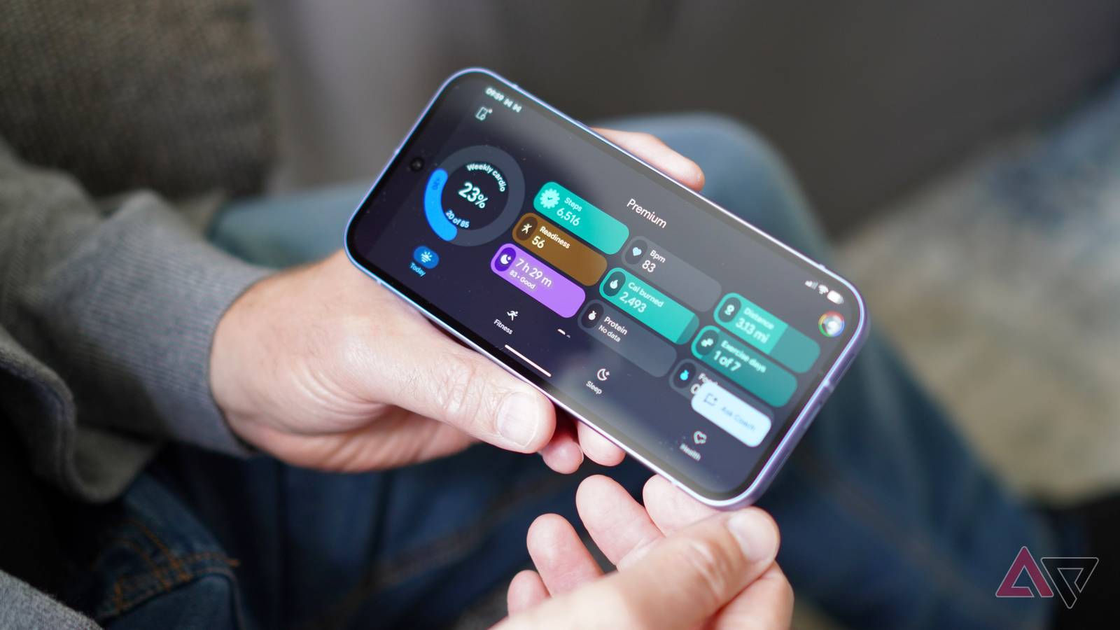
Published Jul 24, 2026, 7:00 AM EDT Rita is a Senior Writer at Android Police. Her love story with Android started in 2010 and has been going stronger with every update, device, tip, app, and game. She's a huge Pixel fan and has spent an inordinate amount of time using and testing Google's ecosystem, apps, and services. She lives in France, speaks more than three languages, follows Real Madrid, and spends any free time she has traveling. Once upon a time, she was a pharmacist as well. When Google said it was killing its Fitbit app and replacing it with a new Health app, I was cautiously optimistic. A central hub for all health things sounds good on paper, but Google's track record of migrating services has been anything but stellar. The first Google Health release confirmed my fears. The app was buggy, missed crucial features, and suffered from some really silly UI decisions. Focusing on the new untrustworthy AI Health Coach at the detriment of everything else didn't help, either. However, after a few updates, the new Google Health app is finally in a better place. Here's what Google has improved and what still needs work. Google fixed the Health app's most egregious issues Who knew that moving widgets was such a groundbreaking feature? There have been three major updates to the Google Health app. The first one was a huge bug fix that solved a lot of tracking issues across devices, services, and exercises. The second update was the most helpful one. It fixed almost everything I hated in the app's interface: widget ordering, nap tracking, hourly activities, food tracking, and more. That made the app a lot more usable. I still can't believe Google had rolled out unmovable graphs and widgets in the first release. I had to remove and then re-add any metric I cared about in both the Today and Health tab. Now, I can tap to replace widgets in the former and drag-and-drop in the latter. Why is there no drag-and-drop in the Today tab? Don't ask me; Google functions in mysterious ways. But at least I can expand the original three-row design to show six rows, which gives me more metrics and less AI on the main screen. That's a win in my book. Nap tracking got a boost, too. Instead of hiding naps below the day's sleep graph, Google started showing them as a separate tab next to your main sleep. They were also added to all weekly and monthly graphs, contributing to the daily sleep total. Google also added many missing nutrition and third-party integration features, and brought back the hourly activity graph that disappeared with the migration, angering many Fitbit fans. The third update packed some bug fixes and minor improvements to nap tracking, but its most important contribution was to the Today tab. Five important sleep metrics — SpO2, skin temperature, heart rate variability, resting heart rate, and breathing rate — became available there. I had to hunt for them in the Health tab before that, often forgetting they existed. Now, I've pinned them to my first page in the app. All of these small changes add up, and the result is a more polished app that I don't have to fight against each time I use it. I feel like I've better tailored it to my preferences now, and I have the information I need in front of me when I open it. Google Health is more usable, but it's not perfect yet There's a laundry list of features to add Right after the app's launch, Google responded to user outcry by listing all the features it planned to fix or implement to quell the bad press. It has already fulfilled most of those promises with the updated Health app, but that's not enough. I need more home screen widget options as a start. A single design that adapts between one and six metrics, no matter how responsive, isn't enough. Worse, I don't really get to choose those metrics because they're hardcoded to emulate my Today tab. When you add the widget from the Google Health app, resize it by narrowing it down to a 1x1 size or expanding it to a 5x3 size. It will automatically resize to show from one to six metrics. My colleague Mark is very enthusiastic about the Health Coach; I am not. It has yet to tell me something useful, so I'm a bit ambivalent about its overbearing presence in the app. I'd prefer if it weren't this much in my face at all times. I would specifically like to see fewer recommendations and useless UI elements in the Fitness tab. I shouldn't have to scroll one full screen before I can view my actual fitness graphs for the day. The Coach should also be less talkative and more demonstrative. Instead of walls of text to tell me I slept worse last night, why not mix some text with a graph of the night's sleep compared to my average? That'd be more impactful to me. Google has a long way to go before Health becomes what it should be Even if it fixes these issues, Google still has a long to-do list to make Health the one-stop platform it promised. It has to merge Google Fit and Health Connect into it, then open up Google Health to allow third-party integrations and reading data from other sources. Perhaps most important, though, is the issue of trustworthiness with the Health Coach. If it continues to invent stats, focus on the wrong things, or not interpret health results accurately, no one will use it. I know I already gloss over half what it says, and there's very little Google has done to convince me to start reading its blabber more carefully. I hope this changes soon. Like the new interface changes won me over, the coach still has a chance.
I was ready to dump Google Health until these updates changed everything
Full Article
Original Source
Read the full article at Androidpolice →KhanList aggregates and links to publicly available news content. We do not host full articles from third-party sources. Always verify important information with original sources.