
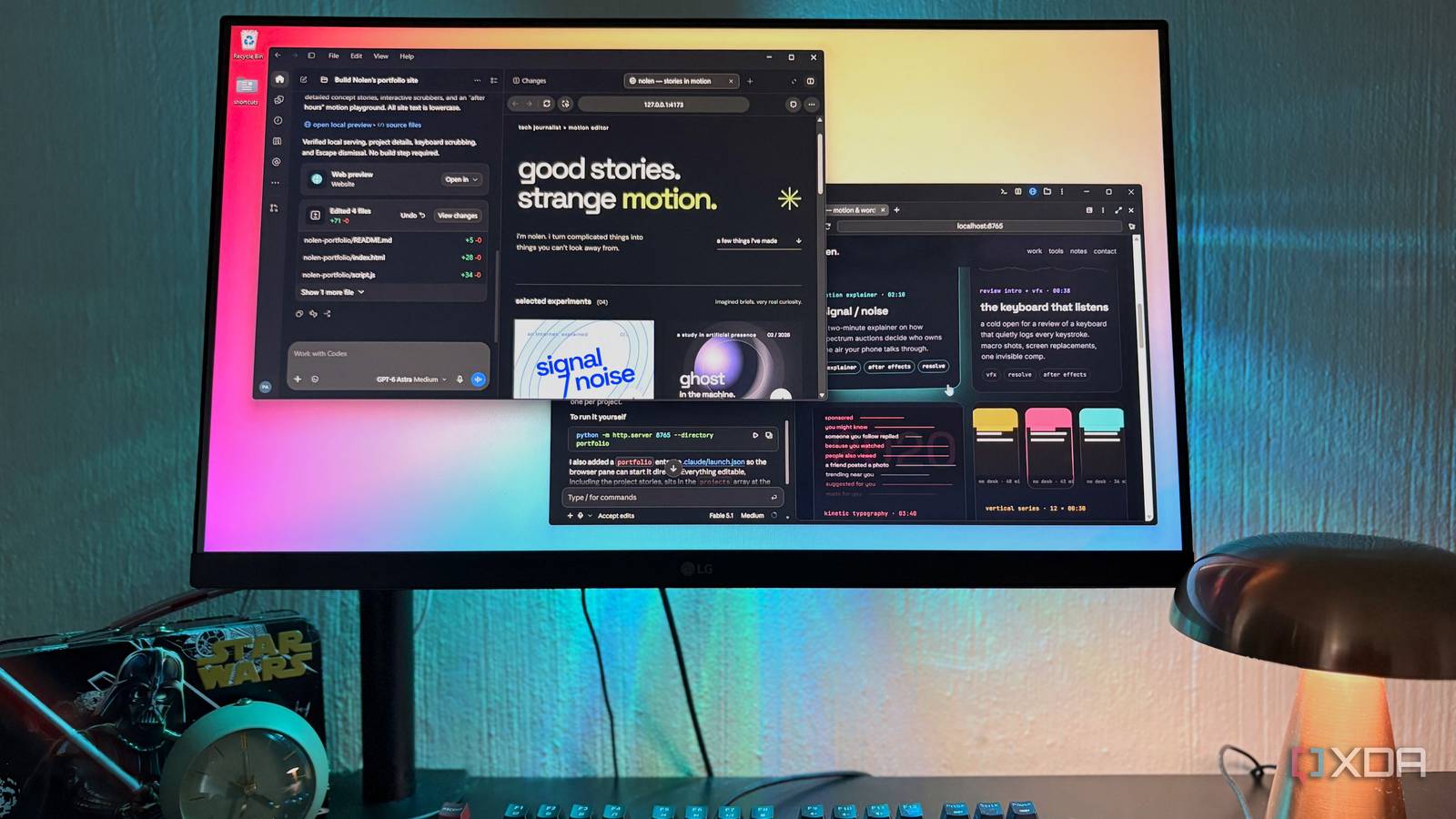
Published Oct 9, 2026, 7:00 PM EDT Nolen began their writing career in 2019, with three years dedicated to editing the Creative section at MakeUseOf. Their expertise lies at the crossroads of technology and creativity, covering areas like photography, video editing, and graphic design. Outside of work, you'll often find Nolen diving into a good book, writing their own stories, or playing video games. Two of the biggest model launches this year happened just days apart, and since then the entire internet has run test after test on them. Naturally, my feed was inundated by all the utilities and designs that people were vibe-coding with Fable 5.1 and GPT-6 Astra, especially when it came to comparing them. I must say, it's been difficult picking my favorites because taste is mainly subjective. So I wanted to put them to the test myself and see how they actually follow instructions and improvise on the spot. A personal portfolio seemed like a pretty fair test. It's something I've been toying with for a while but haven't fully got to yet, so this would be the perfect head-start to get the ball rolling. I gave both the same prompt, and the one that not only gave me the best result but was also the best behaved will be getting the job of helping me finish my portfolio. Two flagships, two days apart Everyone had an opinion on which one designs better, so I gave them the same job Claude Fable 5.1 came out on September 1, with GPT-6 Astra following two days later. Fable 5.1 is Anthropic's most capable public model, built on the same underlying model as the restricted Mythos 5.1 but with extra safeguards so regular users can use it. Astra is OpenAI's first GPT-6 model, and OpenAI says it has better visual judgment when it builds websites and apps. Both cost $10 per million input tokens and $50 per million output on the API. But inside the apps is a different story. On Claude Pro, Fable runs on paid usage credits, which is how I paid for mine, while Astra is included with ChatGPT Plus but draws from the shared Work and Codex allowance (anywhere between 5-45 messages every five hours by OpenAI's estimate). I ran both on Medium effort - this is my favorite reasoning level because it's not as slow or expensive as high/extra, but still produces better results than low. I also ran both in the desktop GUIs. This choice was a no-brainer; both have a browser preview and can actually see their own work, plus it's a lot more interactive than the terminal, which is just better for iteration. The prompt covered who I am and what tools I used, with a few style rules, such as keeping all the text lowercase. I gave it a list of projects to choose from and left some of the projects themselves open on purpose, plus an extra section of each model's choosing, because how they filled these blanks was what I wanted to see. Fable 5.1 in Claude Code It took its time, then went back and checked its own work Fable opened my portfolio with "i write about tech, then make it move," and the bio underneath just says "the work is below. that's the whole bio." This is perhaps a bit too cheeky for my taste, but I did ask for a minimal bio, after all. I guess Fable took it quite literally. For the project writeups, I kept the details light on purpose because I wanted to test how much the models could infer from the prompt. Fable filled in the rest by framing every piece around the story behind it. For example, in my keyboard post it wrote a line about shooting it with a borrowed macro lens, which I never told it, but it could have inferred from the image files I gave it. The vertical shorts were described as cut on a phone in Alight Motion within an hour of a tech story breaking - they weren't tech news stories specifically, but news stories I turned into short motion graphics nonetheless. Visually, it kept the page very balanced. In motion graphics, contrast creates focus, but it needs a balance or it will just create janky, jittery chaos. And I feel like Fable nailed this with both the stills and the animation. The page was dark with a lot of color, but the colors were subdued and perfectly matched the undertones of the background. Hovering over a project or tool card lifted the card slightly with a soft glow. Each tool card got its own animation tied to the actual app, for example, Figma has shapes, text, and a cursor that moves into place when you hover. Furthermore, opening a project card brings up a timeline scrubber with acts and a running timecode, so the detail view is basically an editing timeline. It also added a "field notes" section on its own, with lines like "if the viewer notices the easing, it's too much easing". After the build, it screenshotted its own pages in Claude Code's browser, then it kept working and caught little issues like lines overlapping. So it checked its own work without me having to ask. GPT-6 Astra in Codex Five minutes, a clear direction, and a lot of color Astra was done in about half the time Fable took, and it even told me its plan before getting started. The Codex side of the ChatGPT app is nice to work in, too. Every diff shows up in a changes panel next to the chat, and there's an Annotate button in the preview for marking up the page. It also checked keyboard navigation and reduced-motion support without being asked, which Fable didn't bring up. The portfolio hero says "good stories. strange motion." in huge type, with an acid yellow asterisk off to one side. It's confident and very polished, I can definitely see what it was going for. The write-ups for my projects went more abstract, though. Astra called them "selected experiments" and leaned a lot on big concept-film themes to describe them. This was perhaps a little over the top for my taste. Every project got a big full-bleed cover in its own saturated color with very sharp edges, and one is pretty much an orange sunburst poster with "look again" across it. This is a lot bolder than I'd hoped for - they're visually appealing on their own, but four in a row just creates too much business for me, it almost reads like a magazine. Hover motion was also there, but it felt underwhelming next to Fable's, almost like the movement was linear instead of a Bézier curve. The detail view had a nicer structure with sections like "the question" and "behind the frames", plus a scrubber called "your turn to edit" that morphs a soft shape into a resolved one. Its extra section was a tiny motion lab with orbit, scatter, and breathe buttons - this was the most playful bit either of the models built, which I do appreciate. The loudest page isn't always the one you remember At the end of the day, it just comes down to personal taste. Astra did a good job and it would make for a good magazine spread, but I feel like it tried a little too hard to be bold and captivating. Everything on the page competed for my attention at the same volume, whereas Fable's creation had more dips and peaks that held my focus. Fable also understood the context of who I am and my projects a little better. I’ll probably end up using Fable’s codebase as the starting point for my actual portfolio, though it’ll need a fair bit of tweaking and proper project details before I publish anything. Codex
I used Fable 5.1 and GPT-6 Astra to build the same portfolio — the difference was immediately obvious
Full Article
Original Source
Read the full article at Xda-developers →KhanList aggregates and links to publicly available news content. We do not host full articles from third-party sources. Always verify important information with original sources.