
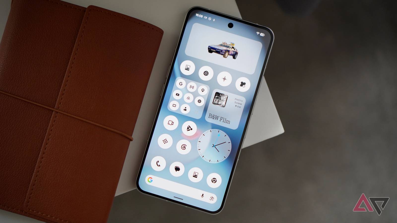
Published Aug 26, 2026, 6:00 AM EDT Andy is a seasoned technology journalist with more than 15 years experience in the mobile industry, writing for Digital Trends, Wired, and more. Andy has reviewed hundreds of smartphones and tablets, dozens of smartwatches, and a host of smart rings, smart glasses, and fitness trackers, giving him a unique ability to assess and evaluate the latest products. His daily mobile tech life includes Android and iOS devices, smart rings, and a smartwatch, unless it's a special occasion, when a traditional watch takes its place on his wrist. Andy always has a strong opinion on the state of the mobile industry, and writes in-depth analysis features to put the latest news and products into context. He has attended multiple CES, MWC, and IFA tradeshows, has a passion for photography and cars, listens to far too much K-pop, and follows F1. You can find Andy's portfolio of work on his Authory page. Nothing has given its operating system an overhaul to coincide with the release of Android 17 for its phones. I’ve been trying Nothing OS 5.0 and Android 17 on the Nothing Phone (3), and here are the five things I’ve enjoyed about it the most, and the one new feature I still don’t really understand. Small, subtle changes Don't expect a total redesign Nothing OS 5.0 isn’t a dramatic change over the existing version of Nothing OS, and instead works to make the design more cohesive, and therefore easier to read and use on a daily basis. The new Geist font is a great example. It’s very similar to the standard Roboto, just bolder, and with less white space between characters. I think it's immediately obvious how pleasant it is to view. There’s a new clock face design called Gooey, more control over widget placement, transparency effects, and a new theme called Lucent. Nothing OS was already highly customizable, and in Nothing OS 5.0 the style has been refined, ensuring changes you make don’t result in an inconsistent look. New Glyph app Making access easier To make managing the Glyph Matrix easier, Nothing has introduced its own dedicated app. It’s so much quicker to change Glyph features in it than digging into the Settings menu, and the interface has the expected Nothing design too. The Glyph Timer now has its own widget, allowing you to quickly start a timer, and the Flip to Start addition (so you can view the Glyph Matrix display) makes it simpler and faster than starting a timer in the Clock app. Using the Glyph Matrix on the Nothing Phone (3) again is another reminder of how poor Google’s HiLight notification light on the Pixel 11 Pro series is, and how much it has to do if it wants to compete with such a varied, fun, and simple to use system. New look home screen You'll have to wait to try it Part of Nothing OS 5.0 is a new-look home screen, which is unfortunately not going to be part of the Open Beta released in August, but I could see in action in my pre-beta version. Select the Lucent Theme and Geist typeface for the full effect, but you’ll spot a redesigned Settings page with a monochrome theme for ultimate readability, an updated Gallery app, and an option to tint the transparent icons too. So far, like the rest of Nothing OS 5.0, the changes are very subtle, and if I didn’t have a cheat sheet for all the alterations, I may not have noticed many of them at all. This isn’t a criticism, it’s confirmation Nothing has focused on refinement and not total redesign when it wasn’t needed. This is the big takeaway here. Nothing OS is already one of the most interesting and unique Android interfaces. Nothing OS 5.0 doesn't change that, it improves it through small, subtle, and optional alterations. If you don't like Nothing's icon design or transparent Lucent theme, it's still simple to switch to standard app icon designs and a basic theme. Nothing could have gone wild with Nothing OS 5.0. Instead, it has remained true to its design ethos, and hasn't pushed all the changes on to an audience used to having full control over the look. It's an impressive update. Looking forward to Micrographics Not available to try yet A feature I really wanted to see in action is Micrographics. It’s part of the always-on screen, where the time, date, weather, and upcoming appointments are all collected in a special section which looks so easy to read at a glance. Unfortunately, it's not part of the Open Beta, and will be coming soon. Further customization options for the lock screen are also being introduced, such as different colors for the clock face, and color matching on the wallpaper too. Android 17 is here Earlier than the competition While Android 17 isn’t all that different to Android 16, it’s great to see it arrive soon after Google’s release on its Pixel phones, and its debut on Samsung phones like the Galaxy Z Fold 8. Nothing is not Google or Samsung, and pushing Android 17 in usable beta form to at least its flagship phone, which was released in July 2025, before rival devices from Motorola and phones like the Galaxy A57, is impressive. In Android 17, Nothing has introduced split-panel notifications and Quick Settings, but you can select the previous single pane in the Settings, and it was left in that state when I updated my phone too. The Quick Share feature apparently now works with iOS and Android, but it didn’t spot my iPhone 17 Pro Max or my MacBook Air when I tried it. You will also spot the new Noto 3D Emoji, deeper customization for HDR video content, and privacy. Not something I'd ever use Nothing has traditionally been pretty good at introducing well-rounded features where the primary reason you may want to use it is clear. This is not the case with the Collector widget. It’s a ‘visual collection’ made from photos you can ‘organize and display on your home and lock screen.’ What does it do? Photos you select or take are edited to cut out the primary subject, which is then added to the Collector widget, where it lives as a sort of sticker in a gallery. You can open the widget and see a collection of these cutouts. That seems to be it. I suppose some people may enjoy making a small collection of haphazardly cut out images, but will they look at them more than once? Who knows. I wouldn’t, and can’t see why I would want to use the Collector widget outside of having to test it in the OS 5 beta. What else to expect from Nothing OS 5? Refining a great design Nothing says the new version of the software will respond faster with smoother animations, touch response, and when multitasking. The Bluetooth controls are simpler than before, and the widget in Quick Settings is especially impressive, with its multi-pane design and iOS-style connection window. There are various AI improvements in the Essential Space app, plus the Essential Voice typing feature is faster, and you can long press the Essential Key to access multi-language transcription, or double press it for language translation. Nothing OS 5 release and compatibility Nothing OS 5.0 will be released for the Nothing Phone (3) as an Open Beta on August 26, with general release coming in October. Android Police contacted Nothing to ask about device compatibility and release dates, and it's good news. The Nothing Phone (3) is first, followed by the Nothing Phone (3a), Phone (3a) Pro, Phone (4a) and Phone (4a) Pro in September, with general release coming in November. The Nothing Phone (2a), Phone (2a) Plus will get the beta in mid-October and general release in mid-November. Finally, the Phone (3a) Lite, Phone (4b), and CMF Phone 2 Pro will see general release at the end of the year or into January.
I tried Nothing OS 5.0 to see the improvements. Here are 5 ways it really impressed me
Full Article
Original Source
Read the full article at Androidpolice →KhanList aggregates and links to publicly available news content. We do not host full articles from third-party sources. Always verify important information with original sources.