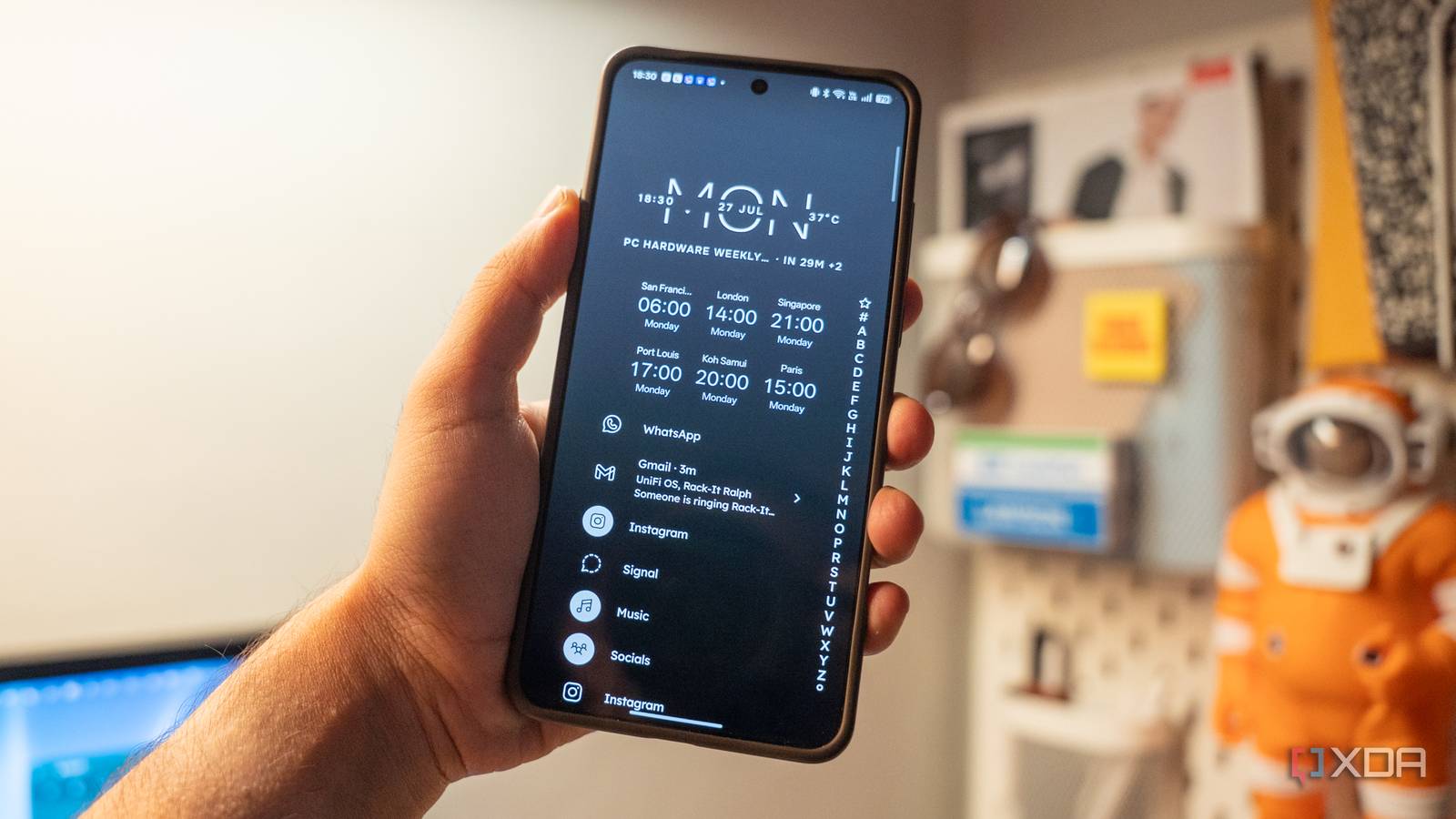
Published Jul 31, 2026, 10:30 AM EDT Dhruv Bhutani has been writing about consumer technology since 2008, offering deep insights into the personal technology landscape through features and opinion pieces. He writes for XDA-Developers, where he focuses on topics like productivity, networking, self-hosting, and more. Over the years, his work has also appeared in leading publications such as Android Police, Android Authority, CNET, PCMag, and more. Outside of his professional work, Dhruv is an avid fan of horror media spanning films and literature, enjoys fitness activities, collects vinyl records, and plays the guitar. As a Pixel user since the first generation rolled out, I've lived through the ups and downs of the evolution of the Pixel launcher. It's clean, it is fast, and it gets the job done. Usually, that's enough. But over the last year or so, I've been looking at ways to spend less time on my phone. Be it by getting to my apps quicker, or spending less time jumping between home screens, looking through folders, or staring at widgets. I needed a change. So, I decided to give Niagara Launcher a shot. Compared to what most users look for in a launcher, I was looking for a tool with less visible customization and a home screen that got out of the way. Having used Niagara Launcher for a few months now, I can confirm that there's no going back. A simpler home screen changes how you use your phone Fewer icons, smarter notifications, and just enough friction to prevent doomscrolling The biggest difference once you've set up Niagara Launcher becomes obvious the moment you unlock your phone. Instead of pages of apps, icons, and widgets, Niagara defaults to a single scrolling home screen. That simplicity is what the app advertises, and that's what you get. My favorite and most-used apps sit front and center, and every other app is a simple swipe away in an alphabetical list at the edge of the display. The launcher doesn't reduce features; it just tucks them away in a way that makes sense. Moreover, the launcher is built around the idea of one-handed use, which I've really come to appreciate now that I've switched to a phone with an oversized display. On most conventional smartphone launchers, you either leave individual apps on the home page or use folders to organize them. If you're like me, these folders keep getting cluttered because you keep adding apps to them without thinking too much, in case you even need quick access to them. Niagara Launcher forces me to be more deliberate because the home screen can contain only a handful of apps. You have to be more intentional about what you add there. It's a great way to prevent clutter on the home screen. In addition to reducing clutter, it's also changed my smartphone usage habits. Since the Reddit app isn't right there on my home screen, I don't instinctively tap the button when I have a minute or two free. Of course, I can still get to it through the full alphabetical list, but that tiny bit of friction is enough to make me spend less time doom-scrolling on social media. Niagara Launcher also takes an interesting approach to notifications, while most launchers will either show a notification dot or just a number indicating how many missed notificationsyou have. Niagara Launcher pulls up information right there on the home screen. Of course, this system works only because you have so few apps on the home screen. With that said, I no longer need to pull down the notification shade just to see if an incoming WhatsApp message is worth my time. Niagara Launcher puts it right there on my home page. Small features add up to a much more productive phone Pop-ups and widget stacks keep useful tools on-hand without clutter We talk a lot about productivity enhancement over here at XDA. In my opinion, productivity is improved just as much through efficiency and minimalism. Both of these are aspects that Niagara Launcher emphasizes. The first feature is Niagara Launcher's pop-ups. Instead of filling my home screen with widgets and folders, I can attach extra functionality to individual apps using gestures. For example, swiping on Spotify to view music controls. While my calendar can expand into a larger widget whenever I need it, I can even navigate straight to my home or work destination by swiping on Google Maps. This integration extends to many third-party apps, like, say, Instagram, where swiping left will let you launch straight into the camera app or even your notifications. It's simple, tucked away, and rather ingenious. Moreover, these shortcuts don't occupy an overwhelming amount of space on the home screen the way that widgets do. That same philosophy applies to widget stacks. Rather than dedicating an entire page to widgets, I can use a single slot and swipe through multiple widgets. I've got the weather, calendar, and task lists added to this slot, and it helps me stay on top of things without a widget completely taking over my home page. Niagara Launcher might sound bereft of customization. That is not true. It lets you switch out icon packs, colors, fonts, and themes, but the base experience remains consistent. Having spent the last month or more using it, I can't say that I fault the approach. Of course, it goes without saying that if you prefer something that lets you tinker around and customize exactly the way that you want, then Niagara Launcher might not be for you. It has an opinionated design and expects you to stick to that user experience. Everyday productivity gains make it hard to go back from Niagara Launcher I originally installed Niagara Launcher because I wanted a cleaner home screen. It gave me that, but I didn't expect to like the usability improvements as much as I did. I've kept using it because it changes how I interact with my phone throughout the day for the better. I'm spending less time navigating interface elements or reorganizing icons and more time getting things done. All that said, Pixel Launcher is not bad at all, but if you want an experience that prioritizes speed and productivity, it is absolutely worth giving Niagara Launcher a shot. Niagara Launcher is a third-party launcher for Android phones that prioritizes simplicity and one-handed use.
I replaced the Pixel's default launcher with Niagara Launcher, and I can't go back
Full Article
Original Source
Read the full article at Xda-developers →KhanList aggregates and links to publicly available news content. We do not host full articles from third-party sources. Always verify important information with original sources.