
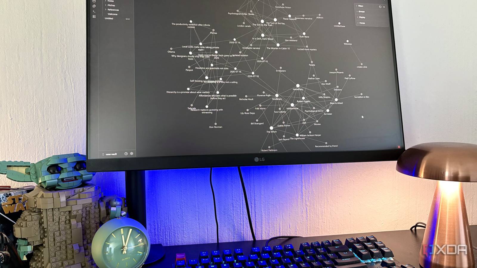
Published Oct 5, 2026, 7:00 PM EDT Nolen began their writing career in 2019, with three years dedicated to editing the Creative section at MakeUseOf. Their expertise lies at the crossroads of technology and creativity, covering areas like photography, video editing, and graphic design. Outside of work, you'll often find Nolen diving into a good book, writing their own stories, or playing video games. Obsidian's graph view is probably the most satisfying part of the app. If you have hundreds or thousands of notes, opening it gives you a really cool-looking interconnected web of dots, and everything is clickable. This graph view also seems to be a core part of second brain setups, and it can make any folder of markdown look a lot cleaner than it is. But getting something out of it is a different story - most people just zoom around for a bit before closing the tab. This used to be me as well, until I realized I'd been trying to utilize the wrong graph view. Turns out, that one's the global graph view, and there's another one called the local graph view. We won't go into how long it took me to figure this out (because that's just a little embarrassing), but if you've been trying to figure out how the graph view could possibly be useful, you might also have been looking at the wrong one. What Obsidian's global graph view actually shows you Turns out the graph view everyone knows is not all that The global graph is the one most people mean when they talk about graph view. It's a core plugin that maps every note in your vault automatically, with each circle standing in for a note and lines drawn between any two that link to each other. Circles get bigger as more notes link to them. There's a button for it in the ribbon, or you can use the shortcut Ctrl + G. Hovering over a dot shows what it's connected to before you click through to the note. The settings panel has a fair bit in it (filters, color groups, display options, plus forces that control how tightly everything clusters), and there's a time-lapse animation that adds your notes back in the order you created them. Now, this isn't useless, it does give you the big picture. But it becomes easy to lose interest, especially if you have a sizable vault with loads of nodes and connections; it just turns into a digital hairball at that point. It shows me that two notes connect without telling me why, or what either of them has to do with whatever I'm working on. I'd reckon that any vault with 10k+ files just isn't very practical to navigate this way. Where the local graph has been hiding this whole time And what it does differently I think that part of the reason the local graph doesn't get as much buzz is because you have to go digging for it, so many users probably just don't know it's there. There's no button for it in the ribbon, and while the global graph gets Ctrl + G, the local one doesn't get a shortcut at all. You have to open the command palette (Ctrl + P), type "graph", and pick Graph view: Open local graph. It's also tucked into the three-dot menu at the top of every note, which I just never bothered to check. Once you select it, it will open in a split-view right next to whatever file you have open. Whereas the global graph shows you your whole vault, the local one only shows notes connected to the one you currently have open on the other side of the split view. My first note popped up with seven connections - I knew they were there, but it really puts it into perspective when you see it laid out visually. It has nearly all the same settings as the global graph, plus a depth slider. At depth 1 you only see direct links, and each level above that pulls in notes linked to the ones already showing. There are also three toggles that only exist here. Incoming and outgoing links do what they say, while switching off neighbor links hides the lines between the surrounding notes so you only see the ones coming off your current note. I recommend playing around with these toggles until you find a view that makes sense for your workflow. What the local graph is actually good for It helped me dig up stuff in my own vault Once I kept my local graph within view, it made me see links I didn't pay attention to before. For example, my heuristics note's local graph pulled up a draft about productivity workflows and a daily note from July that I'd linked once and forgotten about. I don't think I'd have found either of those in the global graph. Now, I also check the local graph before writing a new note, so I link to what's already there instead of repeating myself. The direction toggles help here. Switching off incoming links leaves only what a note builds on. That's handy for working out which notes actually feed into an article idea, for example, before I start outlining it. And the reverse works too if I want to see what leans on the note instead. There are some rough edges. Hub notes wreck it - my by-area index at depth 1 is basically a mini global graph, since it links to almost everything in the vault. Pushing the depth past 2 lands you back in hairball territory pretty fast too. I'd been looking at the wrong graph I still open the global graph in my vault from time to time. But the local graph gets utilized a lot more now that I know it exists. I love that it sits right next to what I'm writing or reading at a given moment, and I wish Obsidian would give it a panel button of its own. If you've only ever used the ribbon version, try the local one on your oldest note and then your newest and it might help you dig up connections you never paid attention to. Obsidian OS Windows, macOS, Linux, iOS, iPadOS, Android Individual pricing Free normally; $4/month for Obsidian Sync
I ignored Obsidian's graph view for years, and it turns out I was looking at the wrong graph
Full Article
Original Source
Read the full article at Xda-developers →KhanList aggregates and links to publicly available news content. We do not host full articles from third-party sources. Always verify important information with original sources.