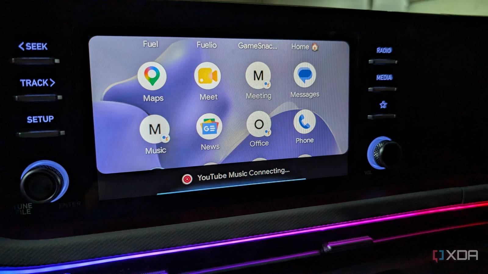
Published Jul 19, 2026, 3:00 PM EDT Parth, a seasoned tech writer, wields the keyboard (or pen) with finesse to unravel the intricacies of both Windows and Mac operating systems. He has covered evergreen content on mobile devices and computers for multiple publications over the last six years. You can find his work on AndroidPolice, GuidingTech and TechWiser. Whether it’s demystifying system updates, deciphering error codes, or exploring hidden features, Parth’s prose guides readers through the binary maze. When not immersed in tech jargon, you’ll find him sipping chai, pondering the next software review, and occasionally indulging in a friendly debate about mechanical keyboards. Android Auto is supposed to make driving simpler, but its default dashboard never quite worked for me. The apps I used most were not always easy to reach, the layout felt cluttered, and I often tapped around more than I wanted while driving. Instead of accepting the standard setup, I decided to reorganize the dashboard around my actual routine. The changes took only a few minutes, but Android Auto immediately felt cleaner, faster, and far more useful every time I got behind the wheel. Reorder the app launcher Hiding apps I never use The first thing I changed was the app order in Android Auto. By default, the launcher showed every compatible app installed on my phone, but that didn't mean all of them deserved equal space on my dashboard. I opened Android Auto settings on my phone, selected Customize launcher, and moved Google Maps, YouTube Music, WhatsApp, Phone, and Audible closer to the top. These are the apps I actually use while driving, so keeping them within easy reach immediately reduced unnecessary scrolling and taps. I also hid apps I never opened in the car. I had multiple music services, podcast players, and messaging apps cluttering the launcher even though I rarely used them. Removing those shortcuts made the interface feel cleaner and more focused. Android Auto stopped looking like a crowded extension of my phone and started feeling like a dashboard designed specifically around my driving routine. Important people are just a tap away Another change that made my Android Auto launcher far more practical was adding shortcuts for my favorite contacts. I pinned my dad, wife, business partner, and a few other people I regularly call while traveling. Earlier, I had to open the Phone app, navigate through recent calls or contacts, and find the right name. It was not particularly difficult, but it added unnecessary taps when my attention needed to remain on the road. I headed to Android Auto Settings > Customize Launcher > Add a shortcut to the Launcher, then selected the Call a contact option. Now, their names appear directly in the launcher alongside my essential apps. A single tap starts the call, which feels faster (and safer) than digging through menus or repeating a voice command when there's background noise. Be careful not to fill the launcher with everyone in your address book. You should only add the people you genuinely contact during drives. Keep essential controls within reach Another Android Auto change that has been useful is enabling taskbar widgets. Once switched on, the taskbar displays useful media controls and navigation information even when I open another app in full-screen mode. For example, since I have a small 8-inch Android Auto unit, I prefer to use Google Maps in full-screen mode. But at the same time, I don’t want to lose access to essential music player controls. Since I have enabled taskbar widgets, I can access play/pause, forward, and backward options right below the Google Maps menu. It may look like a minor interface change, but it removes several unnecessary taps during every drive. I spend less time navigating between apps, and the most important controls remain within easy reach. Combined with my reorganized, launched, and pinned contacts, taskbar widgets make Android Auto feel faster, safer, and better suited to the way I actually use it. Exploring Gemini Actions Saves a lot of time Reorganizing the launcher made Android Auto cleaner, but exploring Gemini actions made it genuinely smarter. Instead of repeating the same long commands every time I get into the car, I created actions for my most common driving routines and pinned them directly to the launcher. They now sit alongside Google Maps, YouTube Music, and my favorite contacts, ready to launch with a single tap. My most useful action is a commute starter. I tap it before leaving, and Gemini navigates to Milestone Pristine, checks the traffic conditions, starts my liked music on YouTube Music, and tells me about my next calendar event. I also created a Heading Home action that starts navigation and sends my ETA to my wife through messages. During longer drives, another shortcut helps me find a fuel station along my current route without canceling navigation or searching manually. I even pinned simpler actions to play a driving playlist and check the day’s remaining tasks. These shortcuts save only a few taps at a time, but that difference matters behind the wheel. My dashboard now matches how I drive I did not expect a few small Android Auto tweaks to change my daily drives this much. Now, everything I need is exactly where I expect it, whether I am starting navigation, calling my family, controlling music, or launching my usual commute routine. I tap less, search less, and spend more time focused on the road. Android Auto finally feels like a driving companion built around me.
I changed my Android Auto dashboard, and it instantly became more useful and productive
Full Article
Original Source
Read the full article at Xda-developers →KhanList aggregates and links to publicly available news content. We do not host full articles from third-party sources. Always verify important information with original sources.