
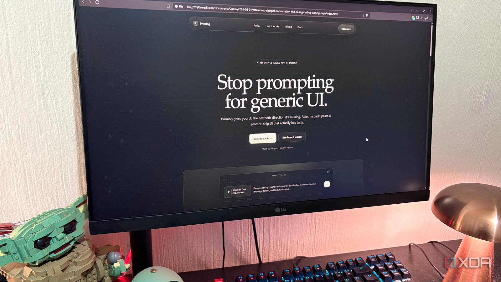
Published Aug 3, 2026, 10:30 AM EDT Nolen began their writing career in 2019, with three years dedicated to editing the Creative section at MakeUseOf. Their expertise lies at the crossroads of technology and creativity, covering areas like photography, video editing, and graphic design. Outside of work, you'll often find Nolen diving into a good book, writing their own stories, or playing video games. Anthropic and OpenAI have both dropped their most capable public models in the past few months. Fable 5 landed in June, and GPT-5.6 Sol landed in July, and the whole online design and dev crowd has been doing what it always does when new flagships arrive: pitting them against one another. A lot of these tests have been benchmarks and coding puzzles though, and those don't always tell you if a model truly understands what you're trying to build. So the head-to-head I actually wanted to see was a proper design brief. I went with a landing page for a slightly weird concept. One of them built a prettier page, but the other built the right one… Want to stay in the loop with the latest in AI? The XDA AI Insider newsletter drops weekly with deep dives, tool recommendations, and hands-on coverage you won't find anywhere else on the site. Subscribe by modifying your newsletter preferences! How you stage a fair fight between two AI models I tried to standardize it as much as possible Fable 5 is Anthropic's newest flagship, sitting a tier above the Opus line in what they're calling the Mythos-class. GPT-5.6 Sol is OpenAI's top-of-the-family answer, with Terra and Luna sitting below it. Ever since both of these dropped, my timeline has been packed with people building legitimately impressive things, from dynamic and realistic animations to video games. Both models run inside agent environments that write to real folders on disk - Fable in Claude Code, Sol in Codex. Anything less would have simply been a comparison between a model with tools and a model without, so this baseline was important. When it comes to standardization, there's no guidebook, I just tried to give both as fair a chance as possible. So by standardization, I'm talking about an identical initial prompt for both, both on the High effort/reasoning setting, both writing to an index.html in a dedicated per-model folder, both opened at the same viewport in the same browser. The prompt itself was designed to test any potential gaps. I locked the copy and the structure, but left the color, spacing, motion timing, and icon choices completely open, so anywhere I didn't dictate, the model had to show its own taste. I also buried one trap in the prompt around an animation. And I set both models to High effort - Fable held there the whole way, but Sol, for some reason, slipped back into Medium when I moved over to Work mode in the ChatGPT desktop app, which I only noticed after the whole thing already ran. Lastly, the thing I wanted to create is not something I'm actually going to ship, least not right now. It's a landing page for a site called Priming, which is meant to be a library of reference packs that designers attach to AI prompts. So it's like a hub of reference materials for vibe-coders and vibe-designers. Fable 5 in Claude Code Twenty minutes of self-verification and an animation that kept overcooking I ran Fable 5 inside Claude Code on high effort pointed at a folder I made specifically for this project. The run took about 20 minutes and only 15.6k tokens. And it didn't just write the file, it ran verification loops on itself, so it read its own output, checked the structure, confirmed no console errors, and verified that the animation actually spawned. That's where most of the time went, which I think is decent-ish, it produced a clean deliverable either way. Typography is where it first started to show its abilities. Serif hero, and then it italicized the word "generic" in sage green. Before the AI era, I would have thought this was super stylish, but all vibe-coded sites kind of do this now. It still looks good, just a smidge predictable, and I never asked for it which demonstrates that it at least took the initiative to add some style. It also self-selected a system serif stack (Iowan Old Style, Palatino, Georgia) because it read the "no dependencies" constraint correctly and refused to pull in Google Fonts. That's taste under constraint, which is a pretty high bar for an AI to clear. The aesthetic hit the brief too. It gave me a near-black background, muted sage green accents used sparingly, brushed-metal touched with vertical hairline striations, and the right buttons. It read exactly like the "premium hardware" I asked for. The structure was also clean throughout: all seven sections rendered, floating glass pill nav at the top, numbered steps under accent-tinted top lines that looked properly editorial, pricing cards with a "Recommended" pill, and a footer signed off with "Made with restraint" as its closing microcopy. Which is a small knowing touch that told me the model had understood the overall tone I was after. Copy improvisation was also on the stronger side. For example, section headlines like "Three steps to output with a point of view" and "Everything the model needs. Nothing it will ignore" were entirely Fable's own writing - and probably sharper than I would have done on the spot. Where it slipped was with the animation. I asked for a raining down of low-opacity geometric shards in the background. The first attempt had them sitting in the middle of the page, bordered, solid, and huge. They looked like UI elements or broken buttons floating around. Fable overcorrected on the wrong axis - they still had visible edges and were still too big. Overall, the visuals and usability were good. The issue was context. Fable understood Priming as a design product and built beautifully around that, but it didn't push into what the product actually was - a tool for people using AI to design interfaces. Nothing on the page signaled that specifically. No mention of the AI tools it plugs into or visual reference to what a "pack" actually contains. Swap the logo and it could belong to about thirty other dark premium dev tools. GPT-5.6 Sol in Codex It caught the one thing about the product that mattered Sol had more environment friction to get to. I started in Chat in the ChatGPT desktop app, and it prompted me to switch to Work because the task was "better suited to it." Then Work handed off to Codex, which is where the file-writing agent actually lives. Chat, Work, and Codex are now three tabs in the same app since OpenAI merged them in early July, so this went over my head in the first few minutes because I haven't been staying up to date with OpenAI. Moreover, somewhere in this mode-shuffle, Sol's effort downgraded from High to Medium, which I hadn't noticed until after finishing the project. So that changed things a bit in terms of my High-effort-mode standardization. The run was actually really fast - two minutes and 25 seconds of actual generation, way faster than Fable's 20 minutes. There was also no per-token cost since Codex runs against my ChatGPT plan usage rather than billing per call. But the local footprint was actually heavier - 11 processes and around 1.9GB of RAM. The file ended up buried in a dated, nested folder structure, something like "Codex/2026-08-01/referenced-chatgpt-conversation..." A little overkill, but Codex clearly has opinions about how real projects should be organized. First thing I noticed opening Sol's page was the scale of it. Everything was a little bigger and bolder than Fable's - massive display serif hero, publication energy, closer to a Rauno site or a high-end design studio than a SaaS product page. Just a different reading of the same brief. And then there was the shards animation. It was way cleaner than Fable's on the first attempt, smaller and more distributed in the background, they didn't obstruct the UI at all. But I still would have liked them to be a bit more dynamic. Either way, the exact instruction Fable overcorrected on twice, Sol did decently on Medium effort in one pass. Comprehension is where it really pulled ahead though. Sol read my website as a meta-tool for people building AI UIs and made a bunch of choices that showed it. The section badge read "Reference packs for AI design." The pack chips named actual AI design tools like v0, Claude, Lovable, Bolt, and ChatGPT. There was a small "Precision Dark / Priming Pack" preview card at the bottom of the hero showing what a pack would actually look like when you attached one. None of that was in my prompt, Sol just invented product texture that made the concept legible. The copy improvisation was a little sharper too. "A better brief, in three moves." "More direction. Less interpretation." "Give the model something worth following." All Sol-written and all better than what I would have written within the same generation time. Even "All systems operational" tucked into the footer was a small tasteful flex. The one area where Sol was softer than Fable was the tactile side of the brief - the nav pill feels heavier and less glass-like, and the buttons are more of a solid green blob than metallic-silver. Two flagships head-to-head The winner isn't the one I would've bet on going in. Fable's page was the prettier one - closer to brief on the tactile side, more thorough on self-verification, and better in the aesthetic details. But Sol read what the product was actually selling and built texture around it, on a downgraded effort setting, in a tenth of the time. I think for a landing page, whose only real job is to communicate the product, that comprehension edge makes Sol the better option than Fable, who focused more on making things aesthetic. ChatGPT
I built a website landing page with Fable 5 and GPT-5.6 Sol, and the winner wasn't who I expected
Full Article
Original Source
Read the full article at Xda-developers →KhanList aggregates and links to publicly available news content. We do not host full articles from third-party sources. Always verify important information with original sources.