
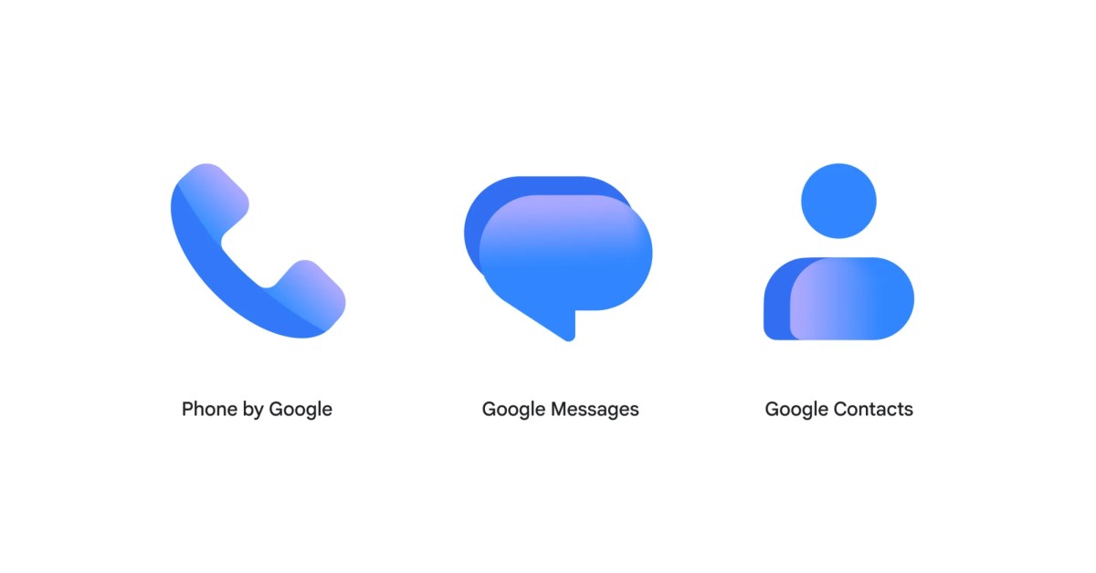
Following the Workspace and Pixel app redesigns earlier this year, Google is overhauling the Contacts, Messages, and Phone icons. Google says the “icons are sharper and clearer” on homescreens thanks to a “subtle but crisp gradient with easily readable edges.” The general shape of Google’s communication apps remains unchanged, but the redesign brings “updated curvature and coloring to align with the rest of the Google apps you know and love.” Current This change is rolling out over the coming weeks, and is already live with the latest Google Messages beta this morning. The new icons should also appear on contacts.google.com and messages.google.com/web. Updating… FTC: We use income earning auto affiliate links. More.
Google rolling out gradient icon redesigns for Contacts, Messages, and Phone
Full Article
Original Source
Read the full article at 9to5google →KhanList aggregates and links to publicly available news content. We do not host full articles from third-party sources. Always verify important information with original sources.