
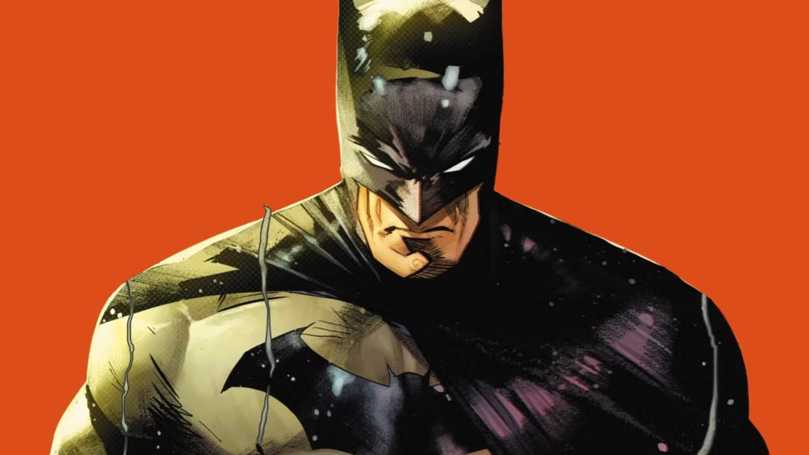
Published Sep 4, 2026, 8:00 AM EDT Derek is the Training Lead for ScreenRant. Before his current position, he spent 20 years working in games, TV, and film while also writing for several entertainment sites. Derek is also the co-host of three pop culture podcasts: Across the Omniverse, The Bad Batch, and Watch Men. While Batman was created in the hopes of getting a second Superman-sized hit on the shelves, the Dark Knight has more in common with the pulp heroes that ruled the racks before the Man of Steel flew onto the scene. A rich man with a dark past who dresses up as a dark figure and fights thugs and mobsters was the forte of characters like the Shadow, the Green Hornet, and the Spider, but Batman quickly overtook them all, becoming one of the most beloved fictional characters in history. Over the years, Batman's connection to the pulp detective stories of old has grown thin. The arrival of the Comics Code Authority forced the Caped Crusader to cut back on the violence and seediness, leading to odder stories where Batman and Robin faced off against aliens or wore rainbow costumes. The 1970s saw a return to the master detective style, mixed with adventure stories and, when with the Justice League, plenty of alien threats. Since then, Batman has ridden the line between his detective roots and being a full-on superhero. But with the variant cover of Batman #15, it looks like DC is paying homage to the pulp era with a mix of modernist art made popular in the 1960s, taking the World's Greatest Detective back to the kinds of stories that made him the icon he is today. David Aja's Batman #15 Cover Is A Thing Of Beauty One of the best artists working in comics today, David Aja's cover for Batman #15 is simply stunning. The bright orange perfectly pops out of the black, creating silhouettes of a gunman, the Gotham City (with the required bats flying over it), and a body. The moon also works as the flash of the gun's muzzle, adding an additional layer of danger to the image. And the inclusion of white marks, indicating damage all too common on old paperbacks, is a very nice touch. This is an image that is worthy of being framed and hung on every fan's wall. Adding to it is the large white space given for the issue's title, "The Assassination of Bruce Wayne." The title itself is intriguing, and the font, a simple but classic style, calls back to the pulp novels of days long gone. This is a cover that would surely stand out on the comics rack at the local shop, making it hard to pass the issue up. To say the least, Aja has created one of his best works, drawing the eye to what matters in the image without overloading it or trying to show off. The cover practically promises the reader that this book will be worth every cent they spend on it and more. Behind this image lies a story — one by modern masters Matt Fraction and Jorge Jiménez — that will take their breath away. And we can't wait to read it. David Aja's Cover Also Calls Back To Two Masters Of Design While David Aja is paying respects to the masters of pulp detective novels, he is also homaging one of the greatest movie poster artists of the past: Saul Bass. The white figure — presumably Bruce Wayne — in particular looks like something right from a Bass piece. Best known for his work with Alfred Hitchcock, Bass changed the game when he created the opening credits to Psycho, and his poster for Vertigo was clearly an influence on Aja's piece. Like many of Bass' posters, Aja's cover uses minimalist geometric shapes to create the image. The body is all sharp angles, as is the cityscape. The use of orange also calls back to Bass' work on posters like the afore mentioned Vertigo, as well as Anatomy of a Murder, and Spartacus. Joseph Caroff was likely another influence on Aja for this over. Caroff, who created James Bond's iconic 007 pistol logo, was also famous for work on the posters for West Side Story (which is very orange), A Hard Day's Night, and The Last Temptation of Christ. Aja's ability to blend the styles of Bass and Caroff with the feel of 1920s and '30s mysteries really makes this Batman cover stand out in an age of superhero titles with endless covers of the hero standing in a dramatic pose. Not that there is anything inherently wrong with those covers, but seeing something different is always welcome. Created By Bob Kane, Bill Finger First Appearance Detective Comics Alias Bruce Wayne Alliance Justice League, Outsiders, Batman Family Race Human Franchise D.C.
DC Debuts New Batman Cover Art That's a 10/10 Must-See
Full Article
Original Source
Read the full article at Screenrant →KhanList aggregates and links to publicly available news content. We do not host full articles from third-party sources. Always verify important information with original sources.