
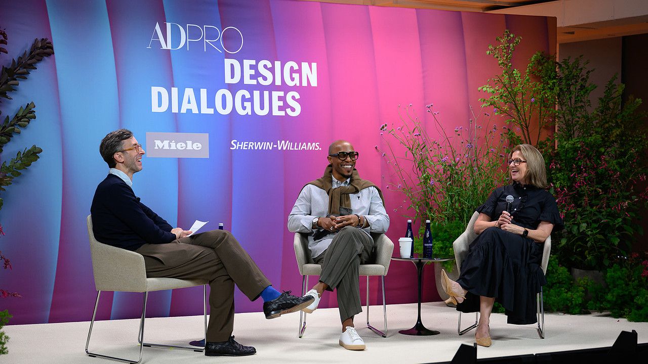
In a social media feed dominated by beige, greige, and oatmeal, color-rich spaces provide welcome relief. Increasingly, homeowners are embracing what maximalists like AD100 designer Corey Damen Jenkins have been touting for years: Not only does color prompt an emotional response, but when used with precision, it can achieve the same soothing effect claimed by safe neutrals. In conversation with AD’s Global Features Director Sam Cochran and Sue Wadden, Director of Color Marketing at paint company Sherwin-Williams, at the AD PRO Design Dialogues summit on September 16, Jenkins revealed why color has become a hallmark of his interiors practice—and how to convince trepidatious clients to embrace its power.See the full video and some of the key takeaways from the panel below:Color helps interiors get personalThis year, every homeowner is requesting personalized interiors. Color can be an essential tool for such storytelling. “Not being tied to rules, but rather to color principles, gives you more freedom to express yourself,” said Jenkins, whose own maximalist home on Manhattan’s Upper East Side seamlessly integrates his husband’s beloved navy blue sofa with red, green, brown, and other jewel tones. “Not everything has to match but it has to flow.” With color, Jenkins tailors clients’ homes based on their own needs, collection, and personalities, rather than following trends. To inspire his own “fearlessness” with color, he often turns to decorative arts history, finding conviction through the work of design icons like Mario Buatta, Billy Baldwin, Mark Hampton, and Jamie Drake.For hesitant clients, start with a small spaceNot everyone is ready to embrace the wow. When it comes to color, “homeowners sometimes need confidence,” said Wadden. “They are paralyzed by choice.” To convince wavering clients to embrace a bolder hue, start small. An intimately-scaled room in a daring color is an opportunity to make a big impact, enticing guests into the “mysterious little world” you create, said Jenkins. “I always tell [homeowners] that life is too short to live in a beige box. Stop thinking about what everyone else thinks.” If pattern feels too scary, solid paint can be a low-lift starting point. “Maybe it’s not your first instinct to start with a color palette but it’s where you play,” said Wadden. “It’s a testing ground, and it’s easy to change.”Balance is key to color successThe key to using vibrant color successfully is to create “contrasting energy” in a room, advised Jenkins. Select a dominant color and mix in other key moments of color or add tonal variation. How do you know if you’ve gone too far with a palette? “It’s emotional,” says Jenkins. “The best maximalism is actually governed by restraint. All the greats knew when to stop.”AD's Sam Cochran, Sue Wadden of Sherwin-Williams, and Corey Damen Jenkins For more of Corey Damen Jenkins on color, see AD's 2025 feature on the designer's home
Corey Damen Jenkins on Color as a Calling Card
Full Article
Original Source
Read the full article at Architecturaldigest →KhanList aggregates and links to publicly available news content. We do not host full articles from third-party sources. Always verify important information with original sources.