
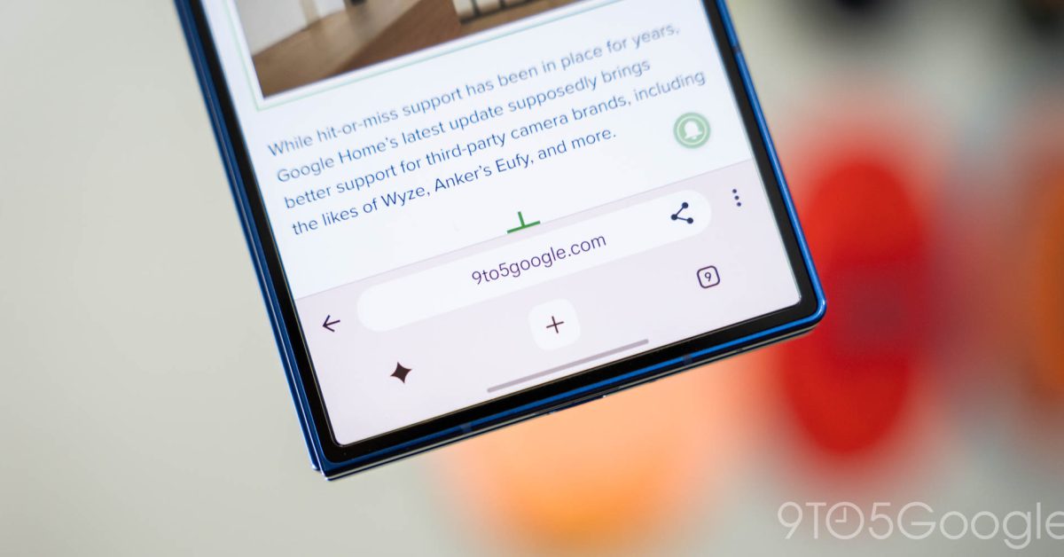
I quite like how Chrome for Android’s main interface has essentially remained the same since 2012. The consistency is refreshing as everything else on my phone changes. While I’m open to modernization, the latest attempt at a redesign suffers from too much chrome. When the browser launched in 2008, the name was meant to signify speed and a minimal graphical user interface, or chrome. On Android, that philosophy has persisted with just an address bar at the top or bottom of the screen. That text field can be flanked by various buttons, but the most minimal state consists of just the tab switcher and three-dot overflow menu. Over the years, Google has just refreshed these elements while keeping the placement unchanged. Old vs. new The upcoming redesign once again adds a secondary toolbar at the bottom of the screen that has buttons for your homepage (which can be disabled), Gemini, new tab, and the tab switcher. This lets Google add a dedicated back button to the left of the Omnibox, while the toolbar shortcut is now placed inside. Google was close to launching a similar revamp in 2020, but ultimately abandoned it because “mainstream users” found it “disorienting.” I don’t mind the Gemini shortcut, and think giving people a dedicated new tab button is a good idea. That was my toolbar shortcut of choice for ages, and Google is now showing a share button by default next to the URL. (Tip: Long-press on the address bar to quickly copy links.) If you keep the address bar at the top, this interface is perfectly fine. However, as a bottom bar user, the stacked interface elements are just so thick. When you first scroll down a page and the interface auto-hides, it really hammers home how much web content Chrome is covering. Things become downright ridiculous when viewing Tab Groups. Having three rows stacked on top of one another looks comical and makes your screen feel infinitely smaller. To me, this interface is not usable, and I’ve forced myself back to the top address bar. Simply making the bottom toolbar thinner would help a great deal. It would salvage this redesign and let Google stick to the browser’s namesake design. This navigation bar redesign is slowly rolling out to the stable channel. It’s not clear whether Google has committed to this interface, but I hope it changes before launch. Ideally, Google would preserve the original interface as an option, but that seems unlikely. FTC: We use income earning auto affiliate links. More.
Chrome’s Android navigation bar redesign has too much chrome
Full Article
Original Source
Read the full article at 9to5google →KhanList aggregates and links to publicly available news content. We do not host full articles from third-party sources. Always verify important information with original sources.