
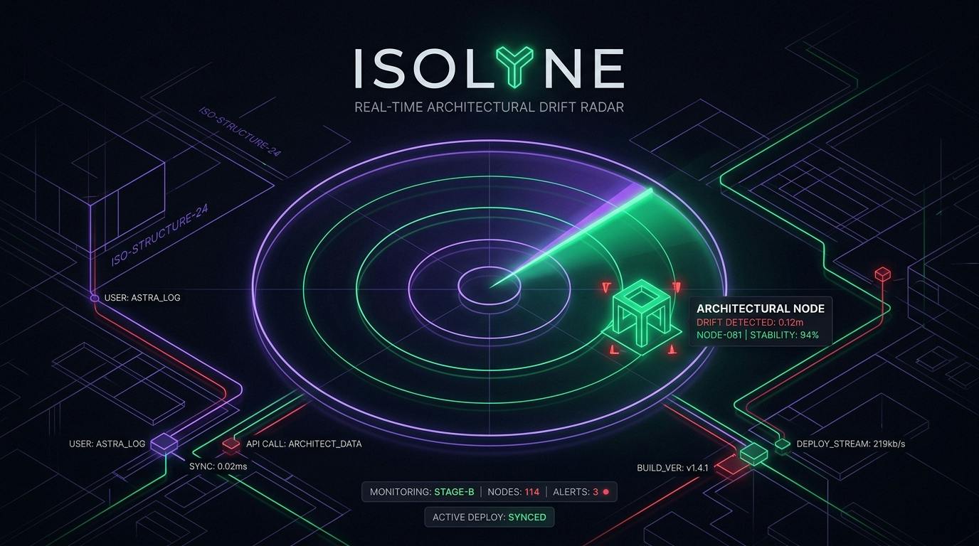
How We Built a Zero-Arbitrary-Hex Design Token System in React Native to Compete for the Shipaton 2026 Design Award Most hackathon applications look like prototypes within the first five seconds. It’s rarely a lack of effort; it’s a lack of systematic constraints: Buttons with five different shades of blue (#007AFF, #1D4ED8, #2563EB). Random padding values (padding: 13, margin: 17, gap: 9). Inconsistent font sizing and jarring light-to-dark contrasts. When we set out to build Isolyne for Shipaton 2026, our goal wasn’t just to build a working CQRS drift engine—we targeted the Shipaton Design Award. To compete with the polished aesthetic of tools like Linear and Stripe, we banned ad-hoc styling and built a strict, tokenized design system (src/presentation/theme/tokens.ts) before writing a single screen. Here is how we engineered our dark-mode visual hierarchy and tactile mobile interactions. 1. The Obsidian Elevation Palette In dark-mode design, pure black (#000000) often feels harsh and lifeless on OLED screens, while standard gray (#1F2937) looks washed out. We developed an Obsidian Base Palette rooted in deep indigo-black (#07080F): export const color = { // Elevation Layers bg: '#07080F', // Deepest canvas bgElevated: '#10121C', // Cards, floating modals bgQuiet: '#0C0E16', // Recessed inputs, nested containers // Structural Lines line: '#1E2130', // Subtle separators lineStrong: '#2A2F42', // Card borders, active outlines // Text Hierarchy text: '#F4F2FB', // Primary high-contrast text textSecondary: '#9A95AB', // Metadata, descriptions textMuted: '#6F6A80', // Timestamps, placeholders textOnAccent: '#1A1630', // Semantic Signals accent: '#8B83FF', // Neon violet brand highlight accentDim: '#2A2750', // Subtle glow backgrounds risk: '#FF6B7A', // Divergence alert crimson riskSoft: '#3A1820', // Alert card background join: '#3DDC97', // Consensus emerald green joinSoft: '#123528', // Resolved card background caution: '#F0C14A', // Pro tier & pending decisions } as const; The Visual Rule Every element in the app must belong to one of three elevation planes (bg →→ bgQuiet →→ bgElevated). When a consensus gap is detected, the card doesn't just change font color—it shifts elevation and border intensity to riskSoft (#3A1820) and riskLine (#5C2430), immediately commanding attention without visual chaos. 2. Spacing & Typographic Rhythm Instead of guessing pixel margins, all screen layouts pull from a geometric 4px-grid spacing scale: export const space = { xs: 4, sm: 8, md: 12, lg: 16, xl: 24, xxl: 32, stage: 48, heroAir: 56, // Generous breathing room for hero states } as const; export const radius = { sm: 10, md: 14, lg: 18, xl: 24, pill: 999, } as const; Typographic Purpose We tuned typography for quick scanning in high-pressure collaborative environments: export const type = { display: { fontSize: 34, lineHeight: 40, fontWeight: '800' as const, letterSpacing: -1.2, }, title: { fontSize: 22, lineHeight: 28, fontWeight: '800' as const, letterSpacing: -0.5, }, body: { fontSize: 15, lineHeight: 22, fontWeight: '500' as const, }, bodyStrong: { fontSize: 15, lineHeight: 22, fontWeight: '700' as const, }, label: { fontSize: 11, lineHeight: 14, fontWeight: '800' as const, letterSpacing: 1.2, }, meta: { fontSize: 13, lineHeight: 18, fontWeight: '600' as const, }, button: { fontSize: 15, lineHeight: 20, fontWeight: '800' as const, }, } as const; Labels use tight uppercase tracking (letterSpacing: 1.2), while hero headings use negative tracking (letterSpacing: -1.2) for a modern, compact display weight. 3. Tactility: Spring Physics & Haptics A great design system is more than static colors; it’s how the interface feels under your thumb. Instead of default React Native opacity flickers, every interactive card and resolution button is wrapped in a custom component powered by spring physics: import React, { useRef } from 'react'; import { Animated, Pressable, PressableProps, StyleProp, ViewStyle, } from 'react-native'; interface AnimatedPressableProps extends PressableProps { style?: StyleProp; activeScale?: number; } export function AnimatedPressable({ children, style, activeScale = 0.96, onPressIn, onPressOut, ...props }: AnimatedPressableProps) { const scale = useRef( new Animated.Value(1) ).current; const handlePressIn = (e: any) => { Animated.spring(scale, { toValue: activeScale, useNativeDriver: true, speed: 20, bounciness: 10, }).start(); onPressIn && onPressIn(e); }; const handlePressOut = (e: any) => { Animated.spring(scale, { toValue: 1, useNativeDriver: true, speed: 20, bounciness: 10, }).start(); onPressOut && onPressOut(e); }; return ( {children} ); } When a user taps [ Choose PostgreSQL ] to resolve a gap: The button springs inward to 0.96 scale. expo-haptics triggers a heavy mechanical thud. The card collapses smoothly, and the radar motif transitions back to a calm green sweep. 4. Accessibility Pass: Never Rely on Color Alone A common pitfall in developer tools is using only red/green to convey status, which fails accessibility checks for colorblind engineers. Throughout Isolyne: Every red divergence card is accompanied by an icon and a bold DISPUTED badge. Every green resolution is paired with a icon and clear voiceover aria-labels. Tap targets meet or exceed the standard 44px hit boundary (hit.min: 44). The RevenueCat Connection: Designing a Paywall That Fits Because our design system was codified early, our RevenueCat Pro Paywall looks like an organic part of the application rather than an ugly third-party modal dropped on top. The paywall reuses our exact color.bgElevated, color.accent, and primitives. When a user navigates to upgrade, the visual continuity reinforces trust—critical for converting free users into paying subscribers. In Part 8... How do we represent the metaphor of team alignment visually? In Part 8, we’ll look into Visualizing Silence—how we built the animated concentric radar motif and sweeping vector beam in React Native.
Building Isolyne (Part 7): Designing Dark Mode for High-Velocity Dev Teams
Full Article
Original Source
Read the full article at Hackernoon →KhanList aggregates and links to publicly available news content. We do not host full articles from third-party sources. Always verify important information with original sources.