
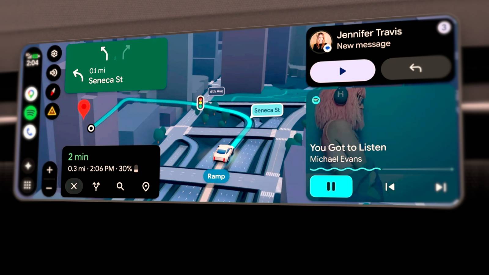
Published Nov 9, 2026, 1:00 PM EST A Computer Engineer turned tech-savvy. Sanya is part of the How to Geek team, and she covers Android, Samsung, Google, apps, and everyday technology, combining hands-on experience with thorough research. She helps readers understand technology without getting lost in technical jargon. My husband and I can’t seem to agree on one thing whenever we’re in the car: the infotainment interface. He’s firmly on Team CarPlay, while I prefer Android Auto and keep finding reasons to defend it. I use it for Google Maps and Spotify on almost every drive, so I notice even the small things that could improve the experience. I’ve often wished Google would refresh the interface instead of making us stick with the same familiar layout. Android Auto 18.0 and 18.1 have caught my attention. I dug into both updates and found four clues about the makeover Google is working on. Here’s what I discovered. Android Auto could finally get a new launcher Hello Cielo Credit: Joe Fedewa / How-To Geek | Google One thing I keep wishing Android Auto would improve is how I switch between apps. I regularly use Google Maps, Spotify, and WhatsApp, but finding an app that isn’t already on the screen means opening the app drawer and scrolling through the list. I’d love a launcher that makes my regular apps easier to access. My husband has already given me enough grief about preferring Android Auto over CarPlay, so Google could at least make its interface easier to use! Say hello to Cielo. Android Auto 18.0 contains a new asset called cielo_launcher, hinting at a redesigned launcher. Version 18.1 adds more Cielo-related animation resources and map-scaling references. Google hasn’t released the new launcher yet, but I’m hoping it brings a more flexible dashboard and makes switching between apps less fiddly. Google wants to make Android Auto feel smoother New animations could change the experience I notice Android Auto’s little interface quirks every time I switch between Maps and Spotify. The screen doesn’t always feel as fluid as I’d like, especially when I move between different dashboard views. I’d love transitions that make these changes feel more natural instead of having elements suddenly appear or disappear. Android Auto 18.1 contains new animation resources for dashboard elements sliding in and out, along with scaling and fading effects. These appear to be part of the Cielo redesign Google previewed earlier this year. I can’t test them in the current version, but I’m hoping the finished interface feels smoother when dashboard panels appear or disappear. I don’t need flashy animation while driving. Android Auto’s light and dark themes could get more attention A brighter interface may be on the way Credit: Joe Fedewa / How-To GeekCredit: Joe Fedewa / How-To Geek I use Android Auto during the day and at night, but its dark interface doesn’t always work for me. During bright afternoon drives, I sometimes find a darker screen harder to glance at, especially when sunlight reflects off the dashboard. I’d like the option to switch to a lighter interface when conditions call for it. I know plenty of people prefer dark mode, but that doesn’t mean everyone wants it all the time. I already switch between light and dark mode on my phone, so having the same choice in Android Auto feels like a basic convenience. Android Auto 18.1 includes light and dark mode assets, including icons for Samsung devices. These could be part of the Quick Settings controls Google is preparing for the redesigned interface. Google has also been working on light and dark themes in earlier versions, but there’s no confirmation yet of how the finished controls will work. I’d still love the option to choose an appearance that suits the time of day, rather than being stuck with one look. Google is rethinking how Maps fits on your car’s screen Better map scaling for different displays Credit: Joe Fedewa / How-To Geek | Google Google Maps is the main reason I use Android Auto, so I notice when the layout gets in the way. My car has a smaller infotainment screen, and the split-screen view feels cramped when Maps has to share space with another panel. I get much more room to see the route on my dad’s SUV's display, and the difference is hard to ignore. I shouldn’t have to give up useful map space just because my car has a smaller screen. Android Auto 18.1 contains map-scaling resources that suggest Google is working on how Maps adapts to different display sizes. It’s still hidden in the code, but I hope Google makes better use of every inch of the screen, especially in cars like mine. Google’s Android Auto redesign can’t come soon enough I’m hoping this redesign goes beyond the four changes hidden in these updates. Google has already teased widgets, edge-to-edge Maps, customizable widgets, Material 3 Expressive styling, and an interface that adapts to different car screens. That’s a much bigger upgrade than a few visual tweaks. Android Auto 18.0 and Android Auto 18.1 are rolling out, but they haven’t brought the redesign to users yet. Google hasn’t announced when the new interface will arrive. I’ll keep an eye on future updates because I’m genuinely ready for a better Android Auto experience. For now, I’ll have to make do with Coolwalk and hope Google doesn’t keep us waiting much longer.
Android Auto is getting a major makeover: 4 changes to know
Full Article
Original Source
Read the full article at Howtogeek →KhanList aggregates and links to publicly available news content. We do not host full articles from third-party sources. Always verify important information with original sources.